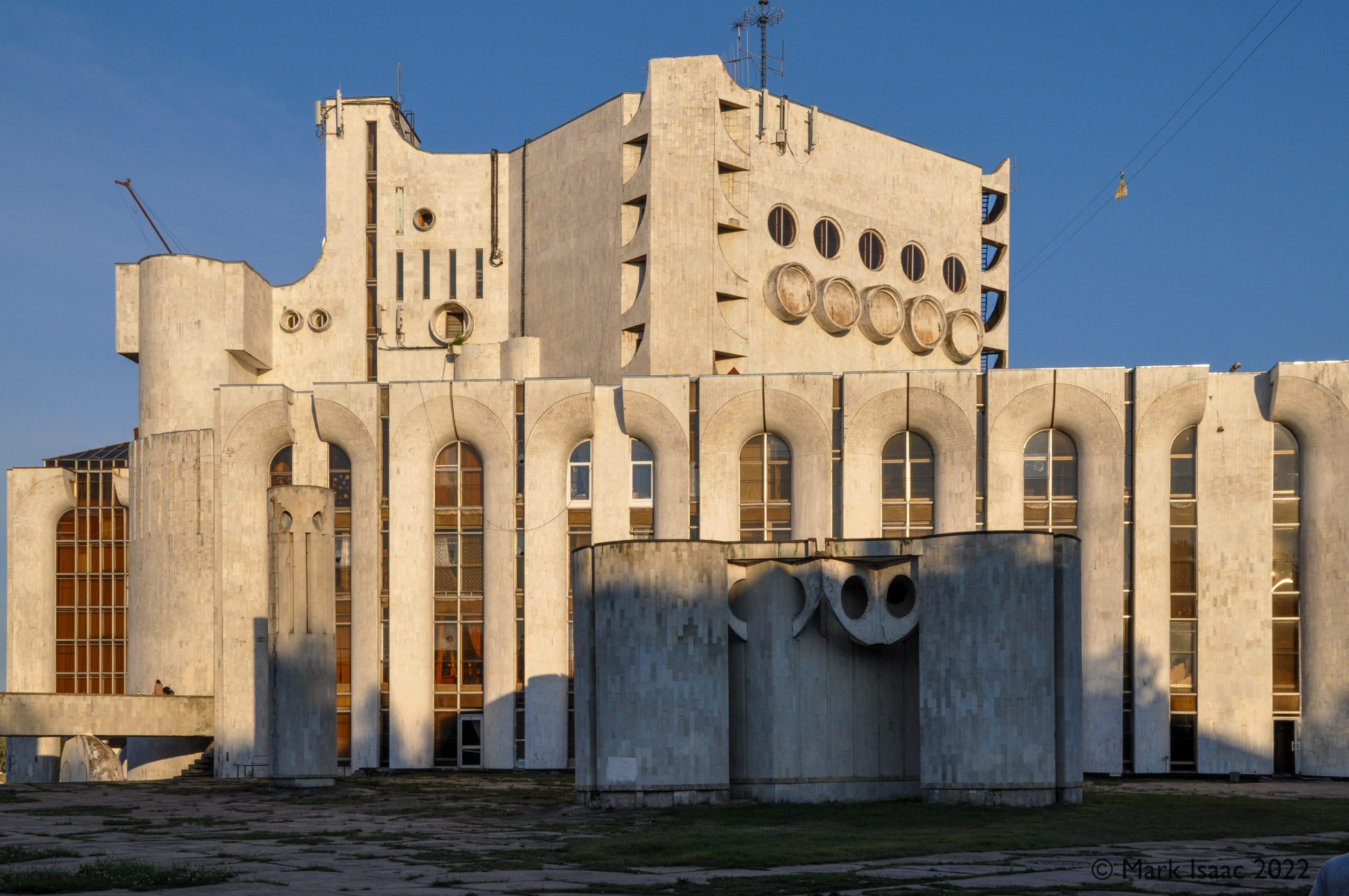
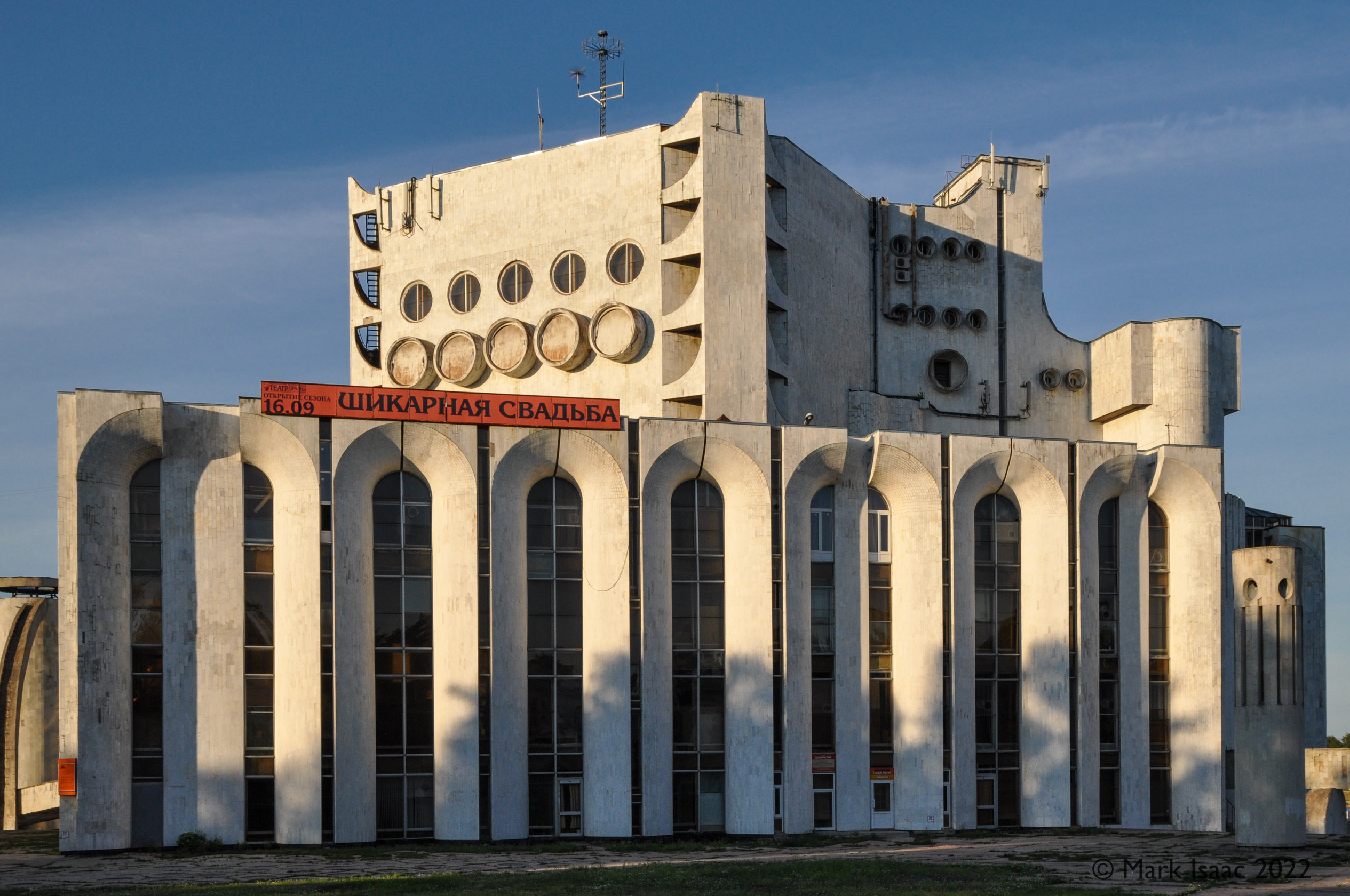
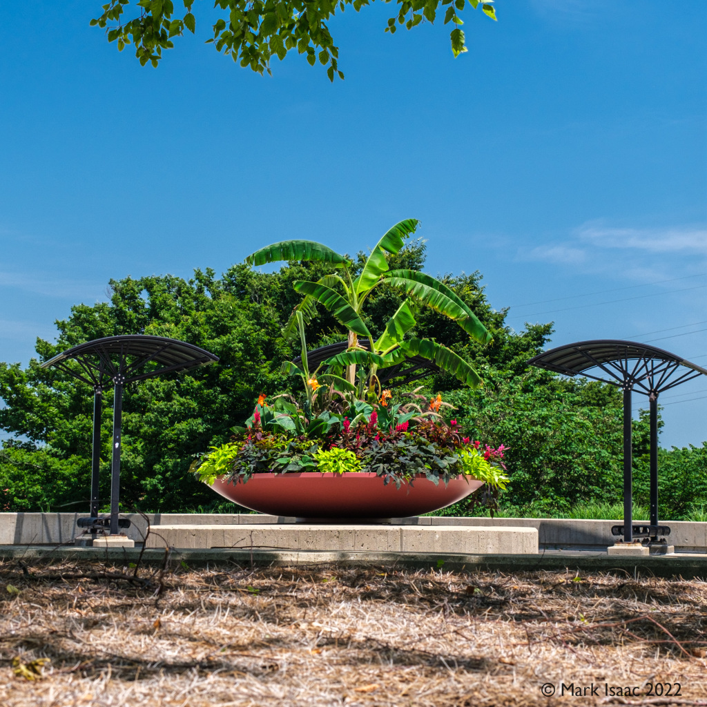
So, here I am at the Flying Cloud Academy Vintage Dance week hosted at Northern Kentucky University (NKU) and playing truant from most of the day’s exhausting dance workshops. I suspect that the campus was first developed with new buildings in the early 70’s. At least, the brutalist architecture leads me to suspect this. Reminiscent of the many concrete excrescences that litter the former Союз Советских Социалистических Республик (ie USSR), for example this theatre in Novgorod, Russia :
the UGLIEST building in Novgorod — a theatre
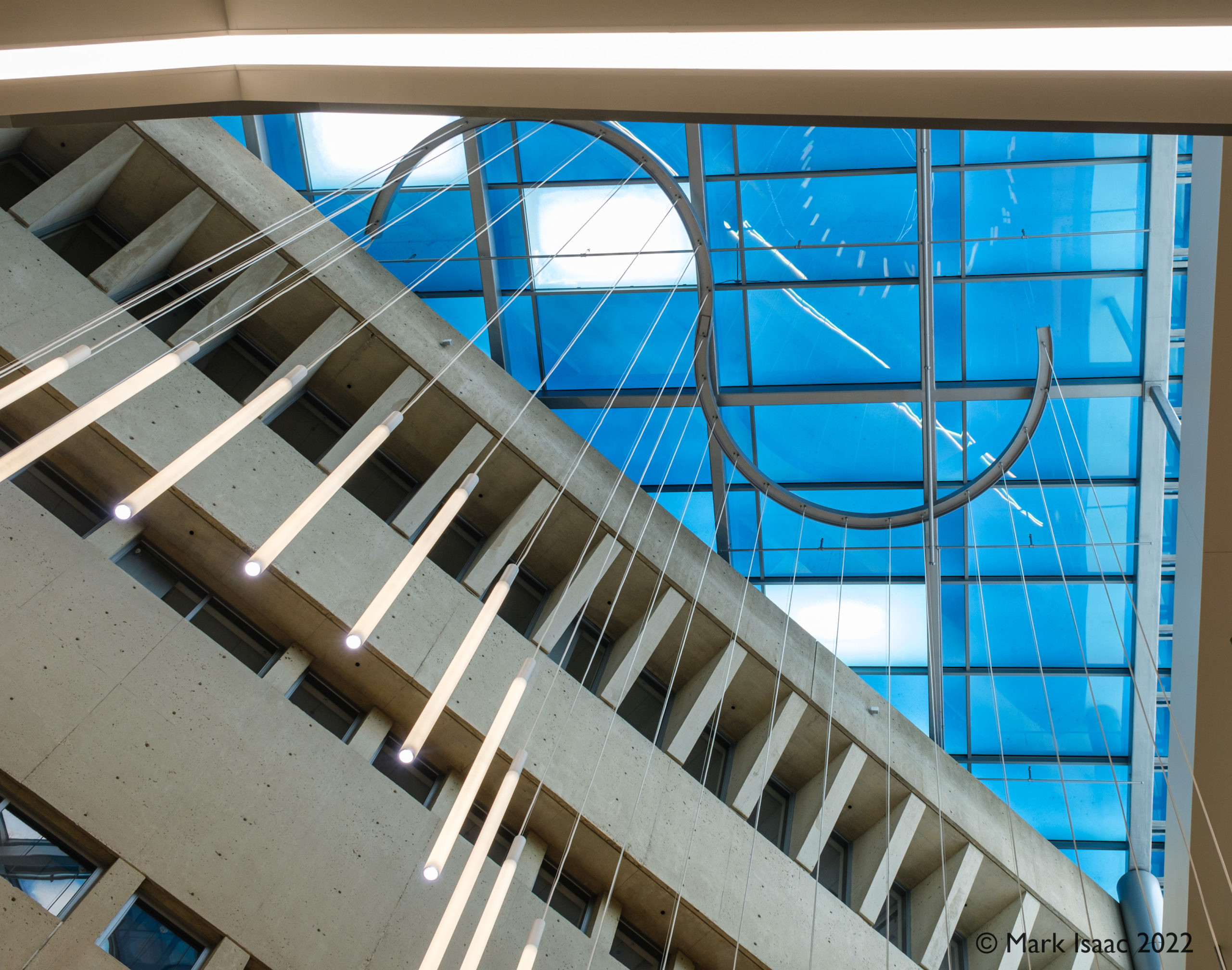
, many of the buildings on the NKU campus look as though they have been washed up by some apocalyptic tidal wave and deposited there. Attempts are made to soften the ambience with trees and other leafy foliage with variable amounts of success. The “Health Innovation Center” [sic] where we had some of the dancing workshops abuts the gigantic Science building possessing the form of a prehistoric stranded cetacean. However, the architects have done some clever things with this space and , in turn, I have taken some different views on what can be appreciated.
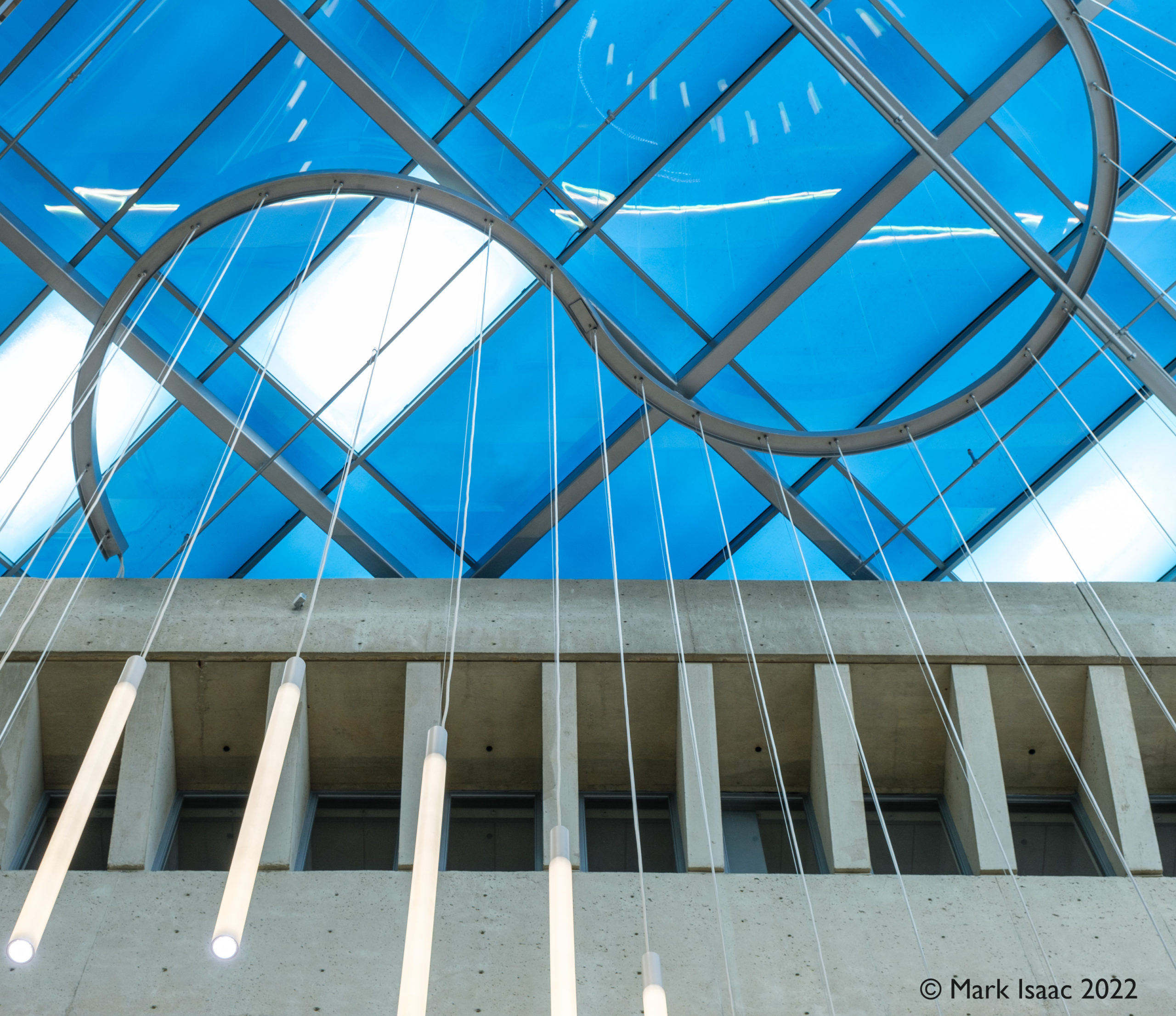
First, in colour :
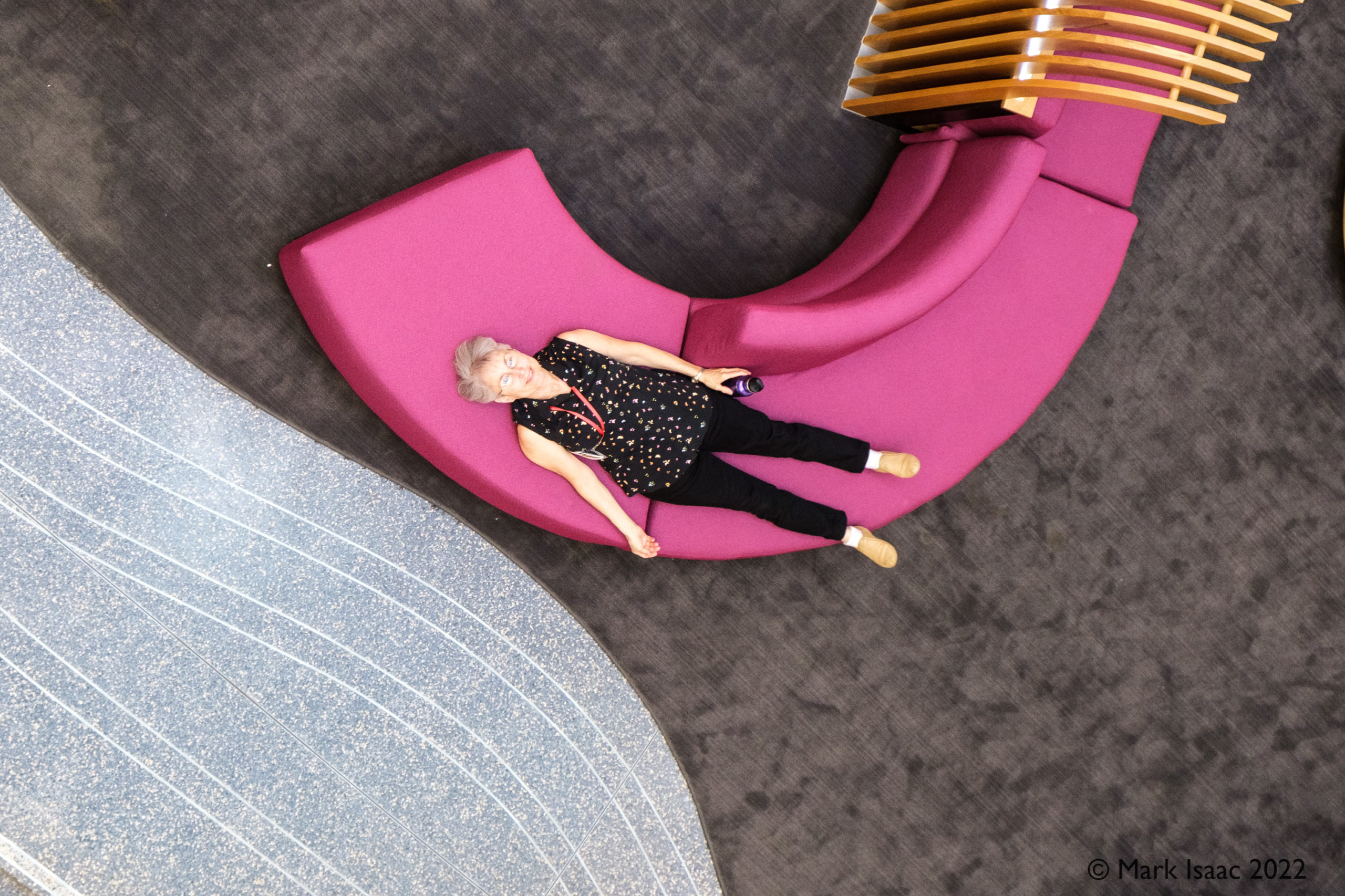
looking down at Erica
The first two are looking upwards at the skylight & then from the third floor I’m looking down on Erica. This latter photo I like a lot and may well enter a print into an exhibition (eg R.A.M or Minnetrista).
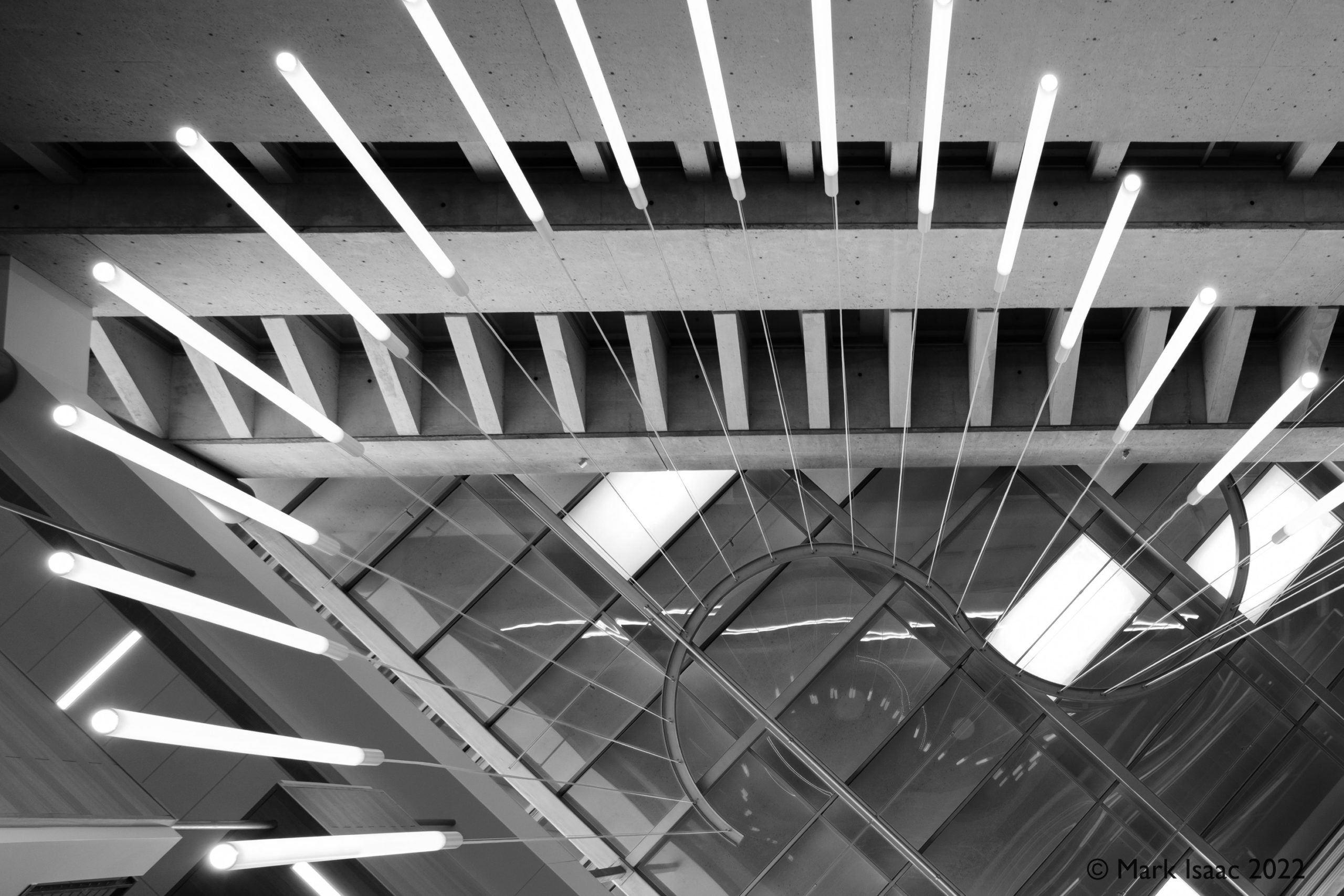
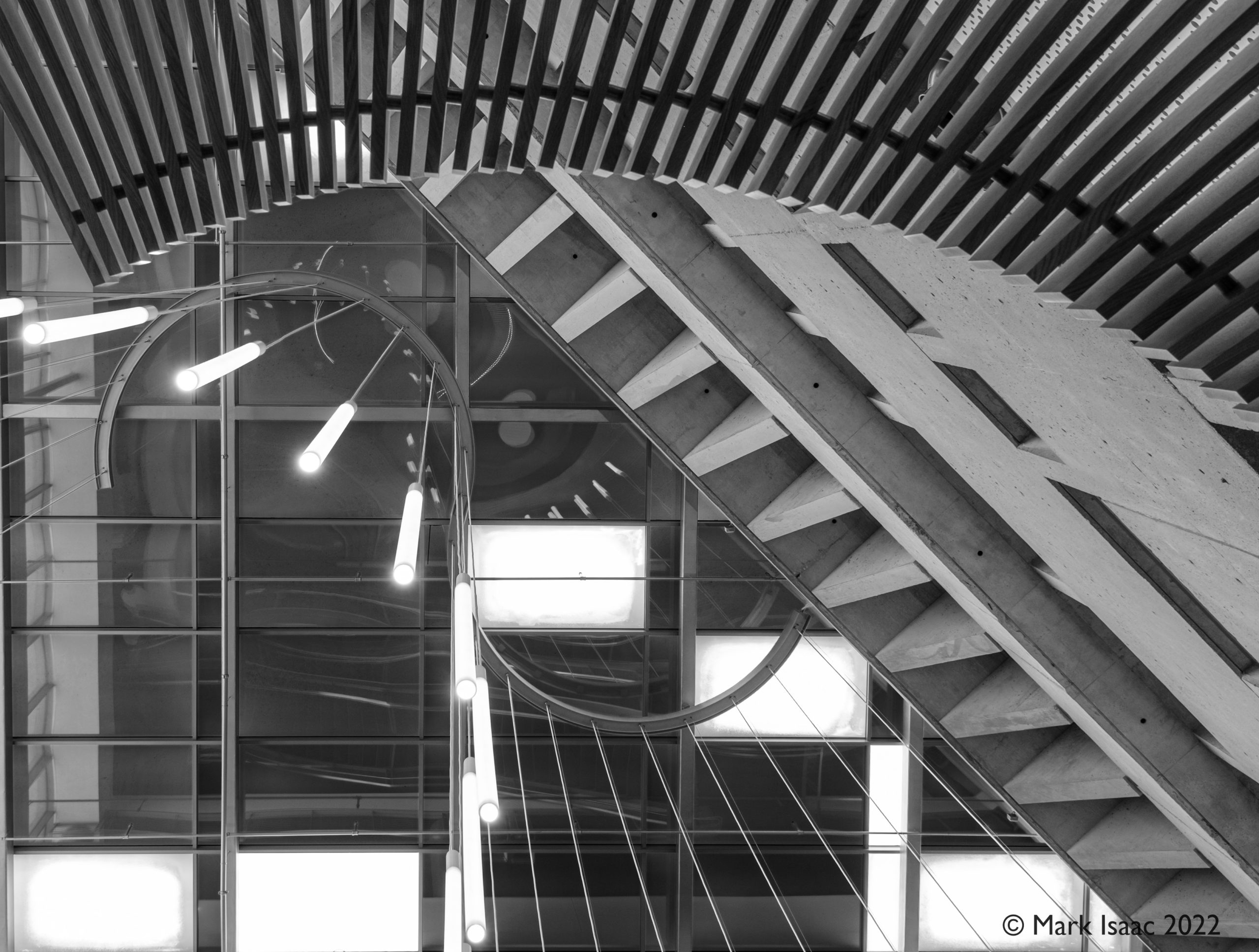
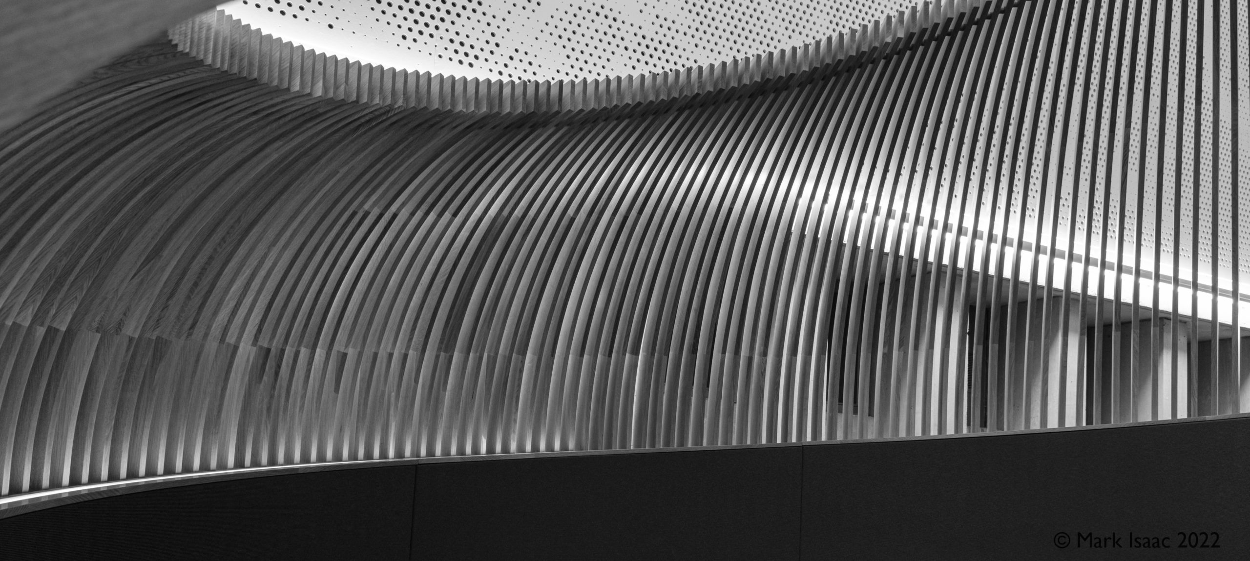
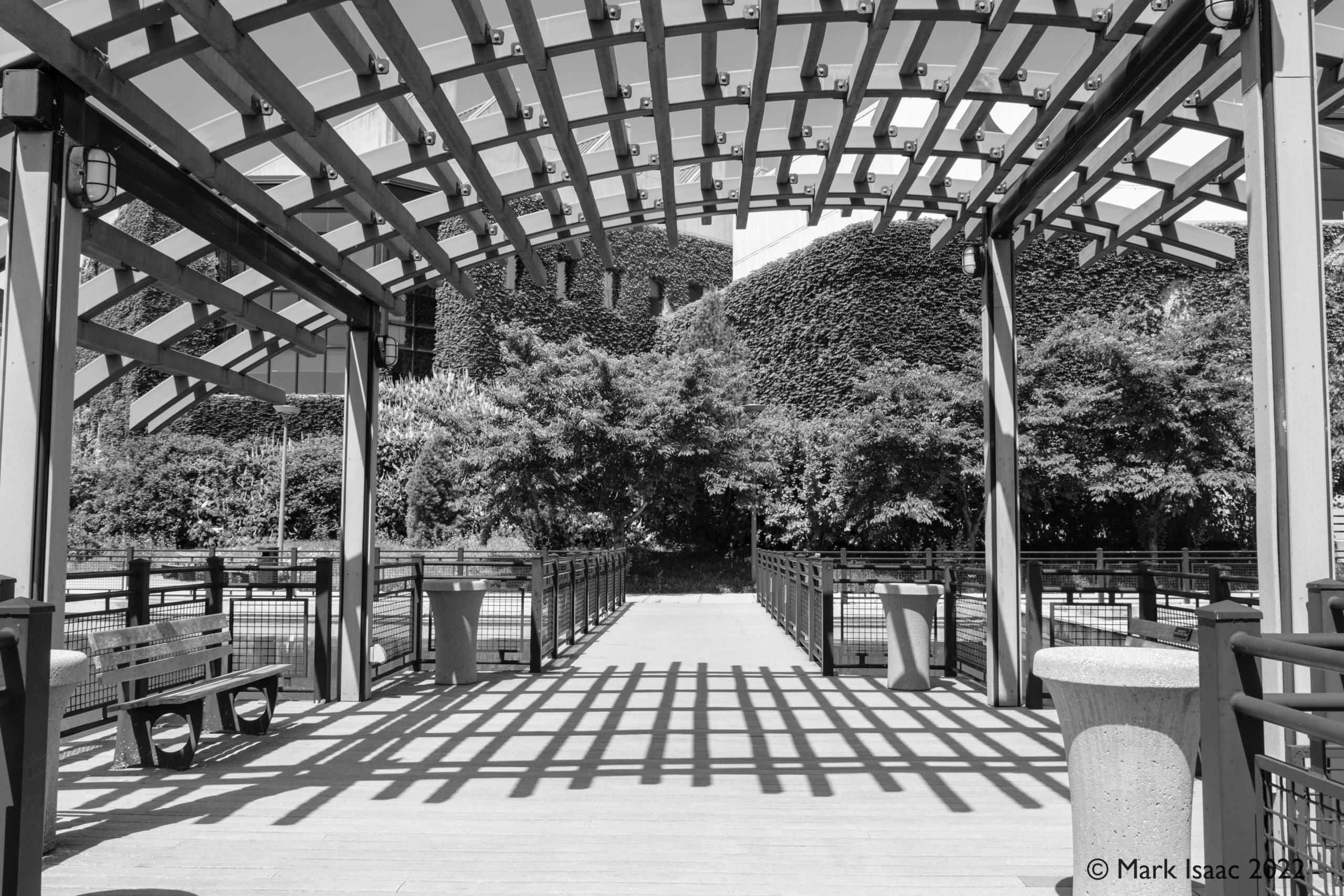
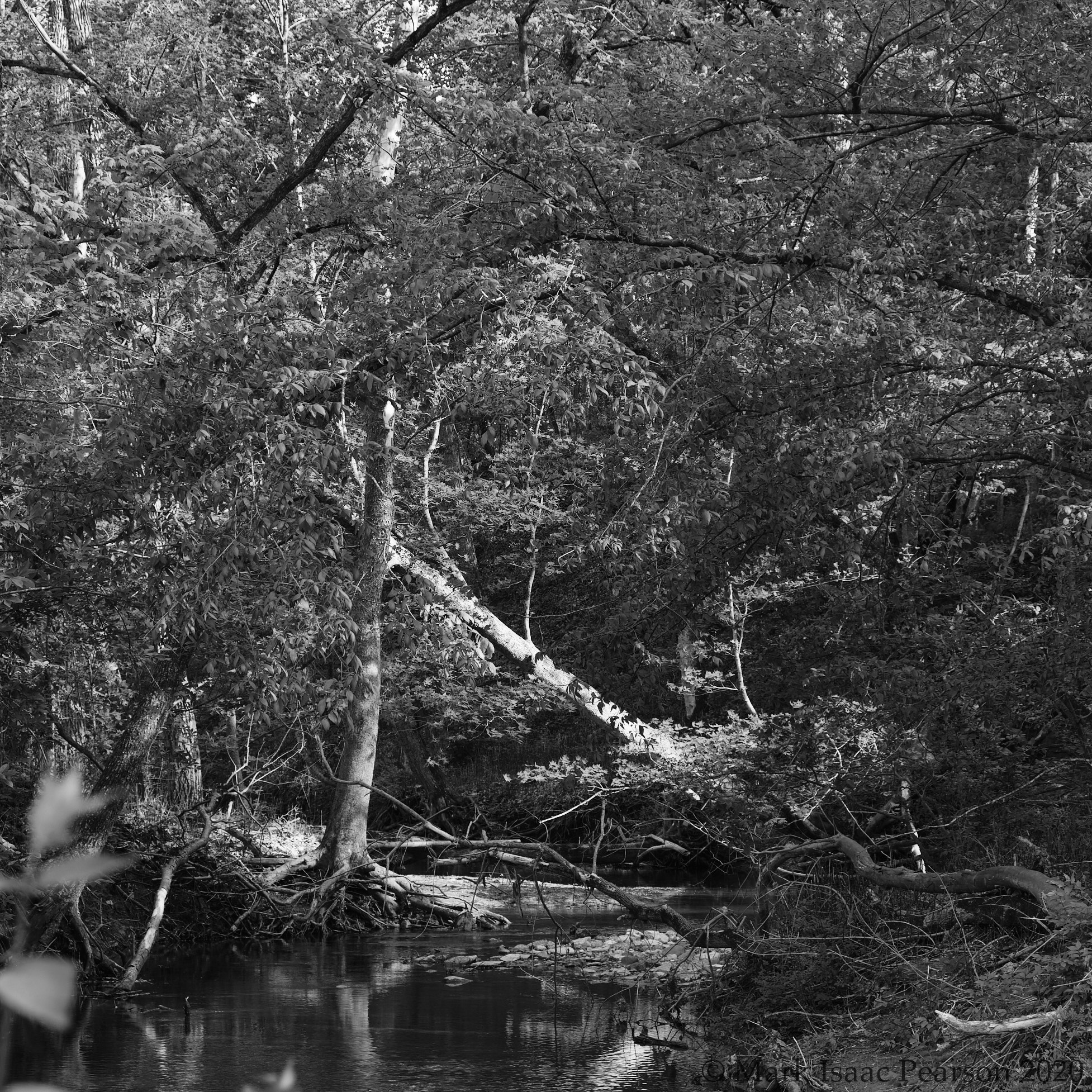
But the fun is with the monochrome :
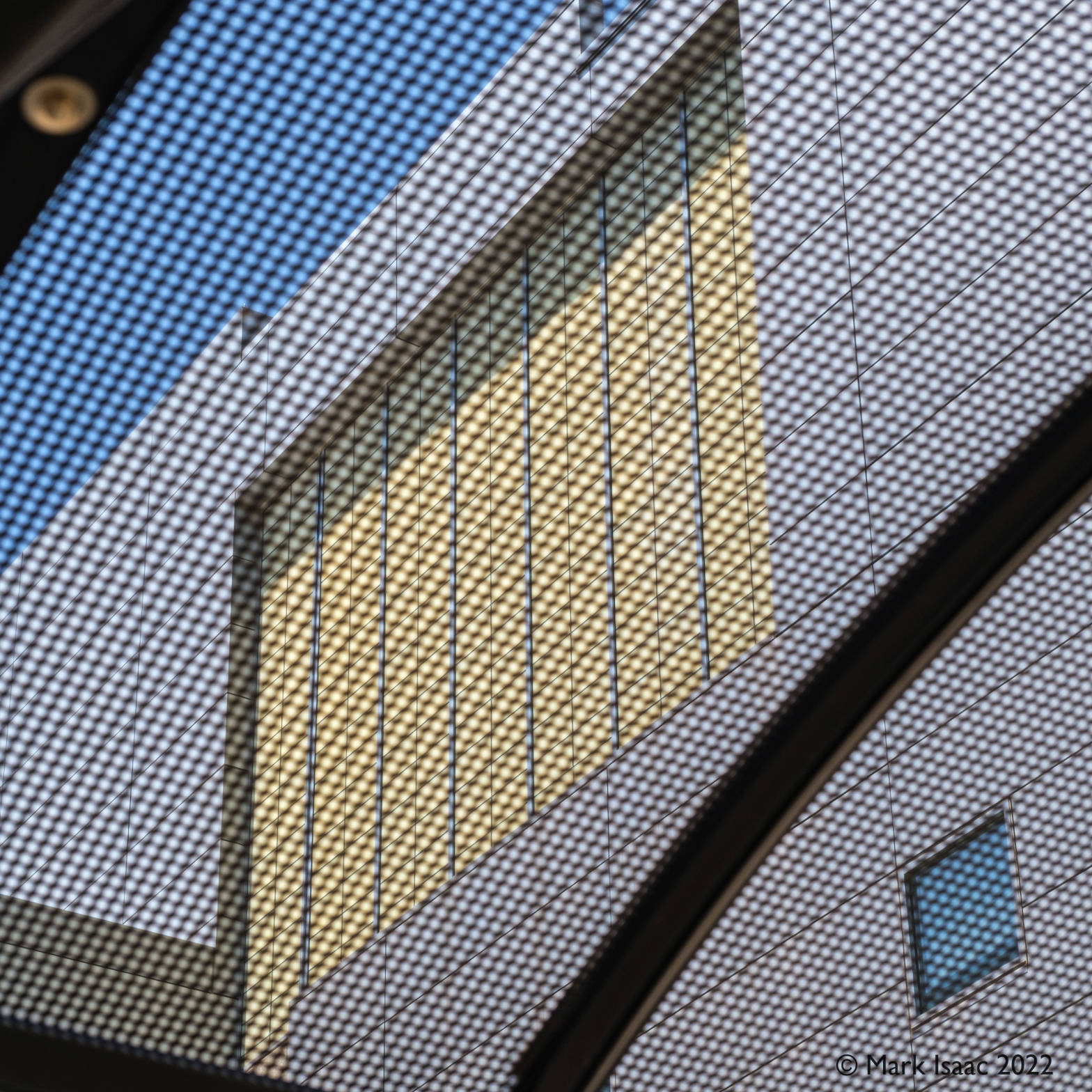
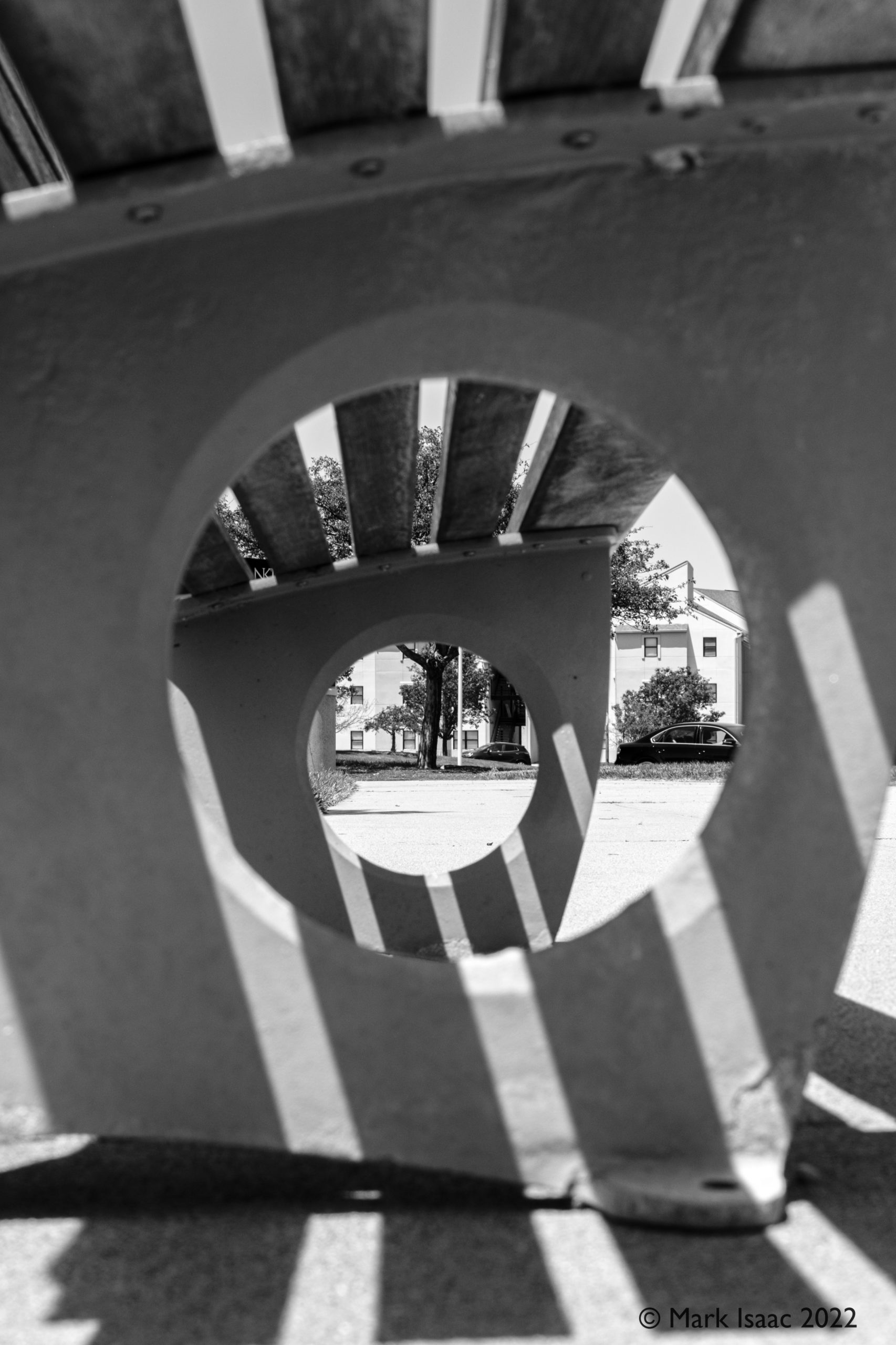
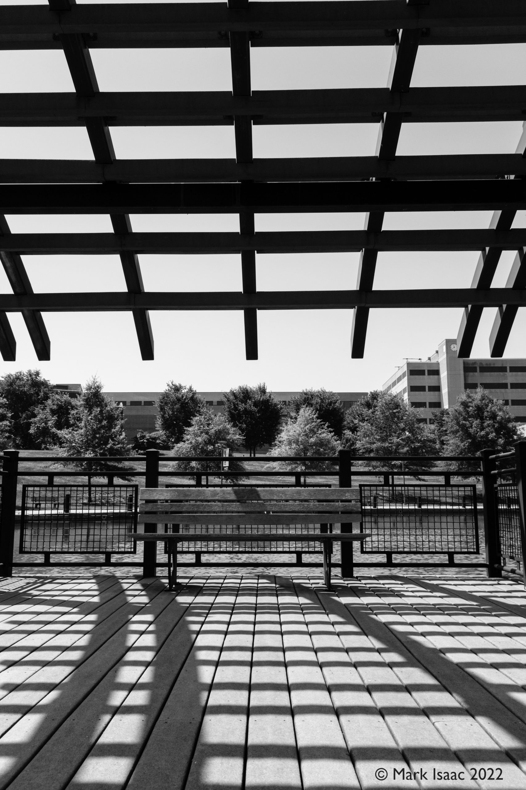
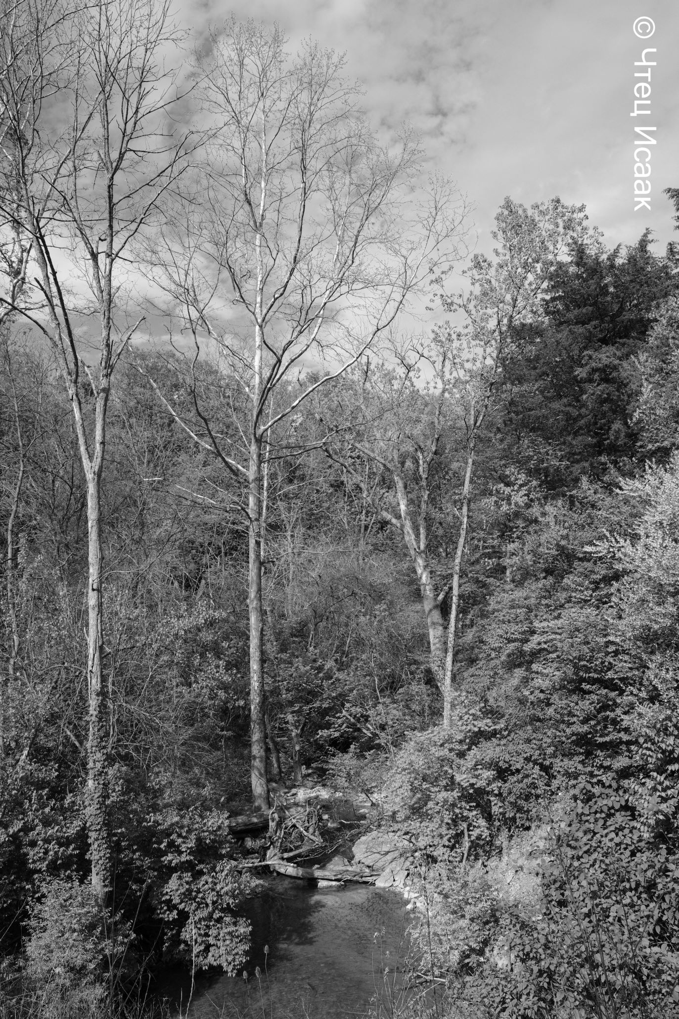
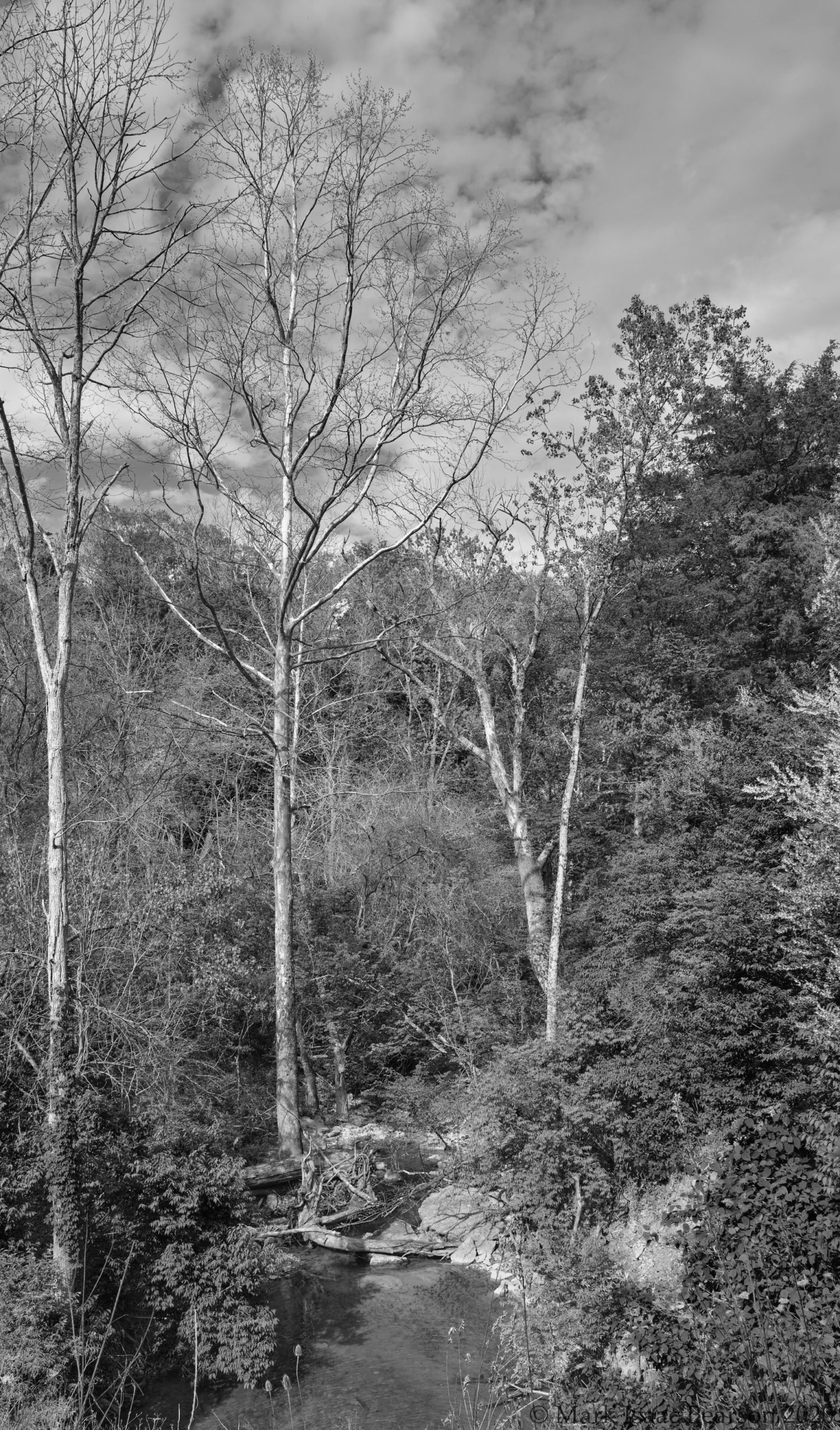
#4 & #5 have had some judicious rotating and cropping; personally I like the shapes and lines that you can get with black&white. Number 5 for example doesn’t give one many clues about what is actually there and how far away it is. However, it’s #6 that a winner for me. As before the monochrome treatment removes colour which in this case I judged to be too revealing & superfluous. From the right side, the background feature seems to meld into the ‘cage’ and then disappear, and what is this strange structure anyway? Thus the abstraction is effected successfully.
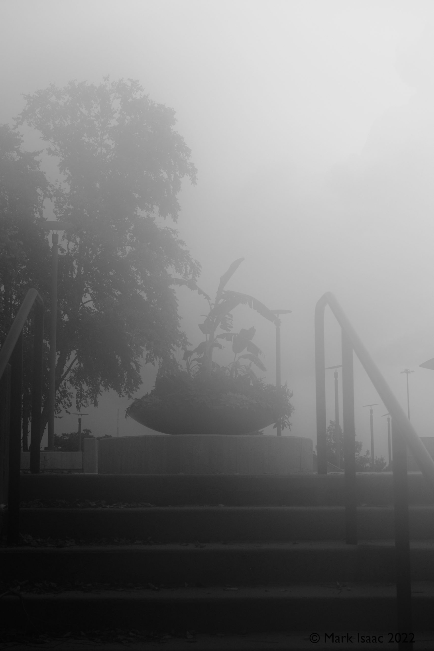
The shade shelters have a mesh which allows light to pass though but dissipates it enough to provide relief. Focussing through such a mesh at the brutalist building behind we obtain an image such as #7, which can perhaps be described as a combination of Mondrian expressionism + pointillist execution + Bauhaus sensibility. Image #8 was taken in an early morning mist, right? Not quite. Actually, the camera lens misted up badly in the humid heat when I took it outside; I snapped this image before the condensation evaporated.
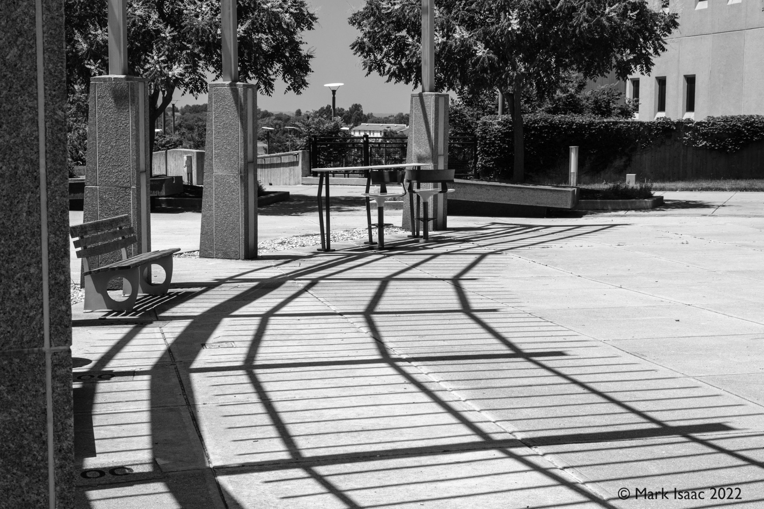
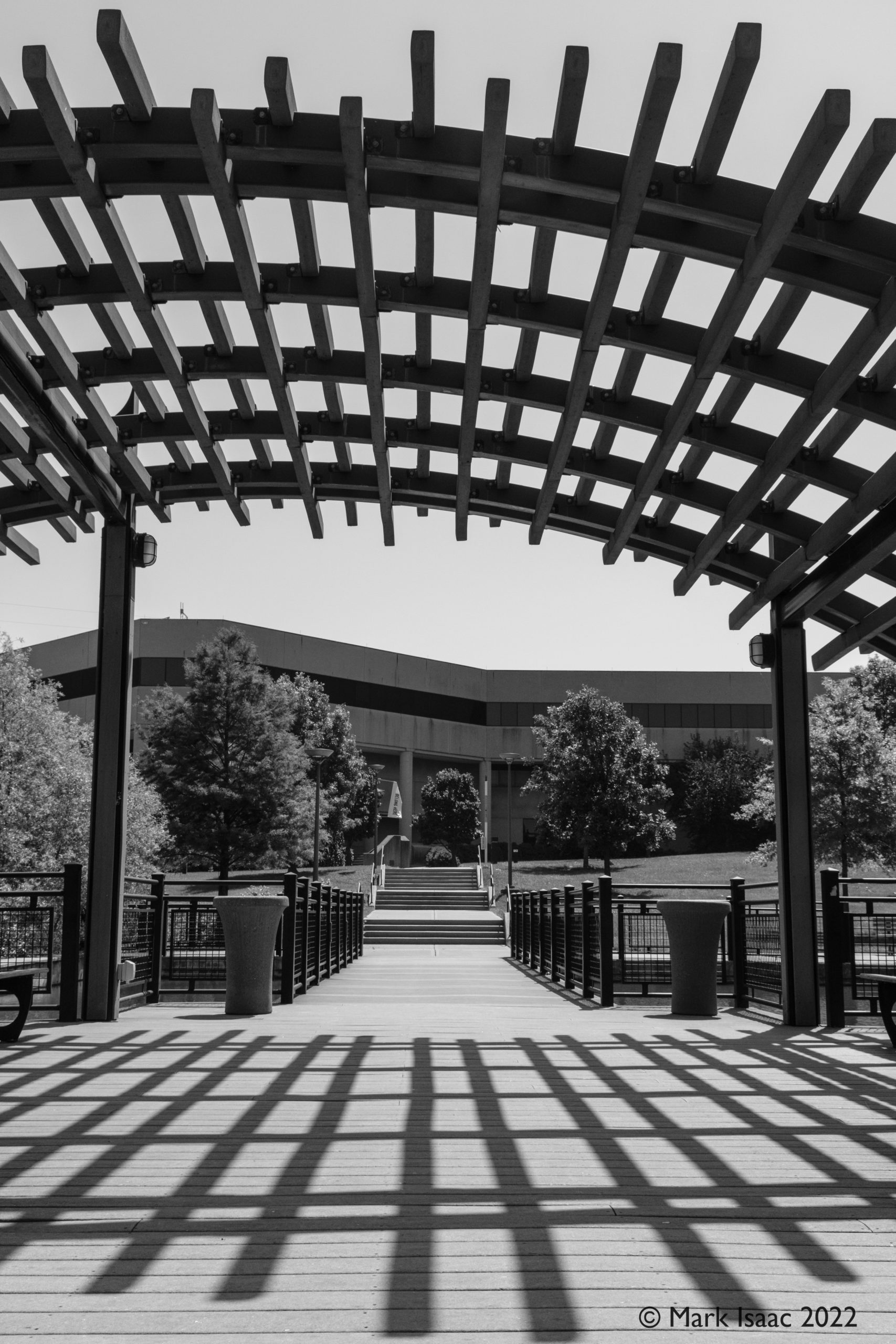
The final set of images are all about shadows and lines; see if you can figure out what is making the shadows in each of these shots.
Not too difficult now, was it? These images were taken over four days of strolling around the N.K.U campus in the mid-June heat and I was thankful for both the opportunity to do this and the open nature of the university campus with its photogenic vistas.
In mid-June 2022 I accompanied my wife, Erica, to the Flying Cloud Academy of Vintage Dance week in Cincinnati, OH. We stayed at Northern Kentucky University (NKU) and I had opportunity to shoot photos there on several days.
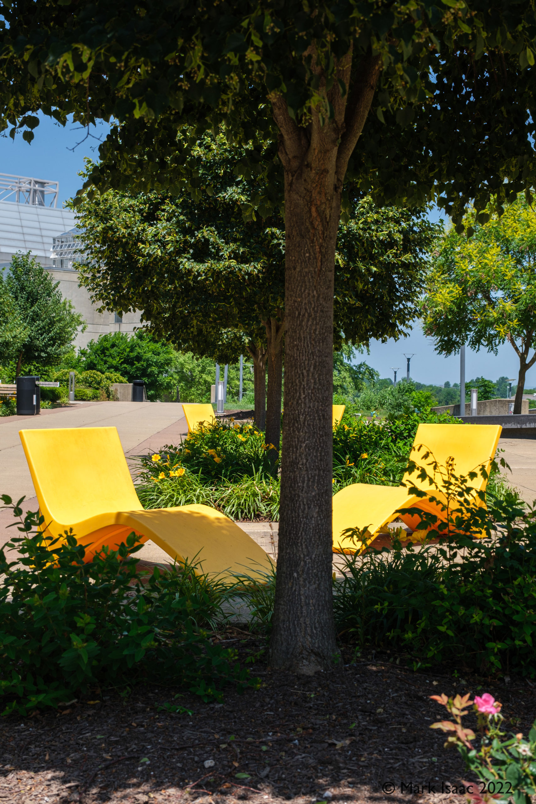
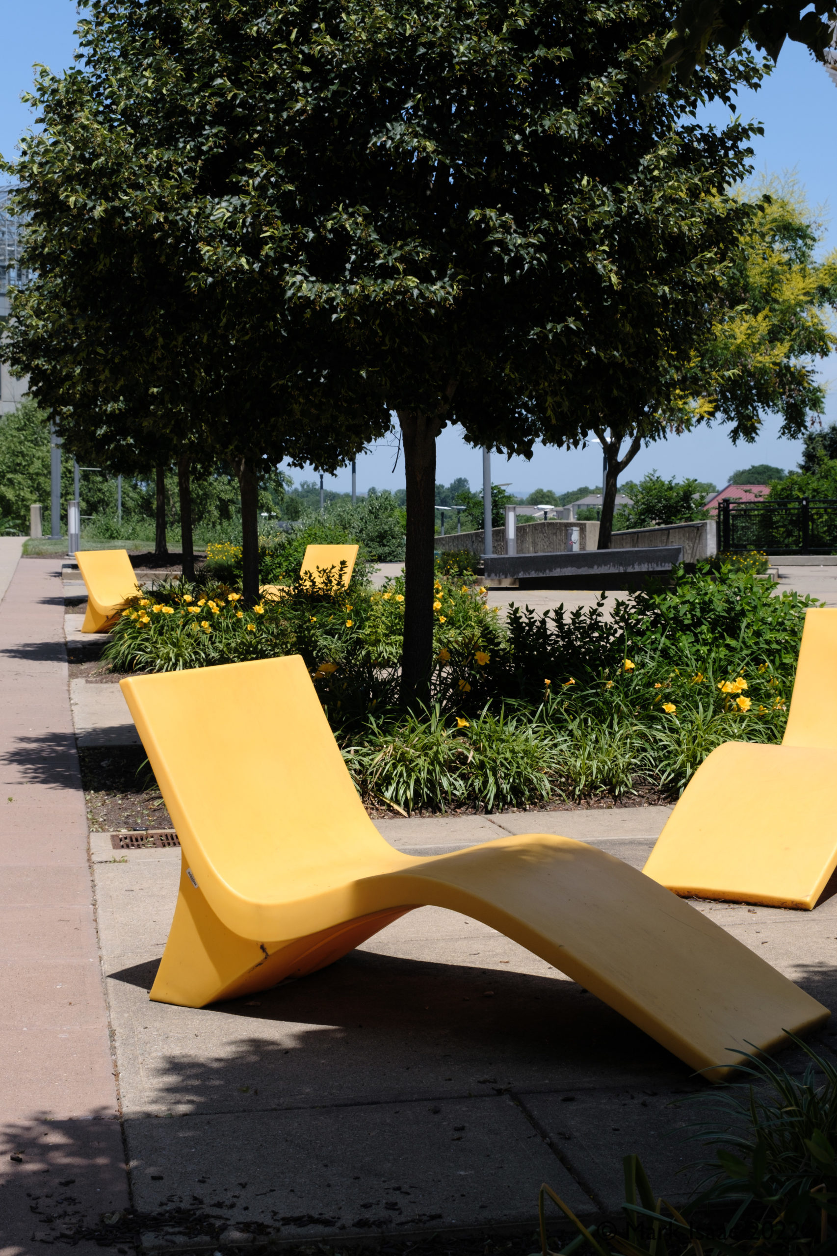
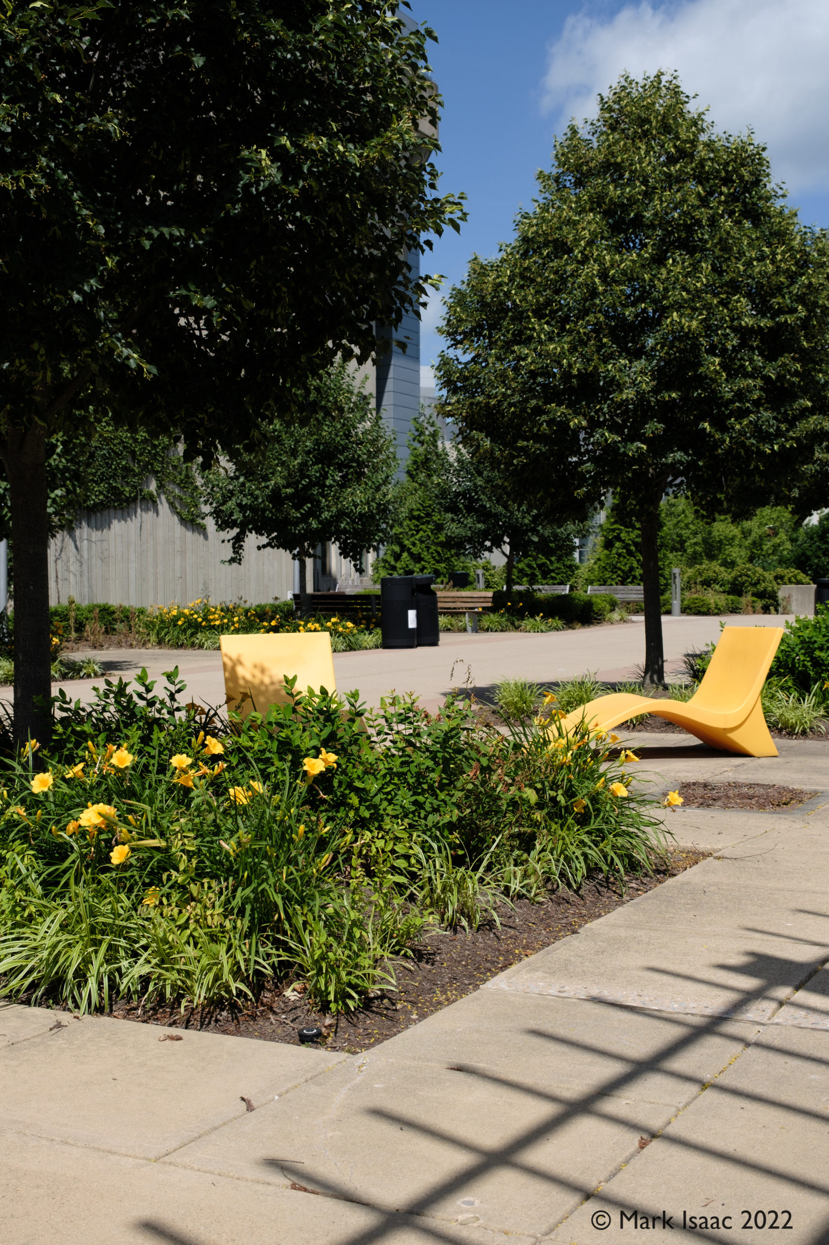
The weather for the week was generally hot & rather humid with a couple of days that were sunny but cooler. I was able to wander around the campus, which is high above the city on the southern side of the Ohio river, looking for interesting vistas. Like “mad dogs and Englishmen” I ended up doing most of my peregrinations during the hottest part of midday. While the brutalist architecture offered little respite from the scorching sun the well placed trees, shades and sun splitters located mid campus provided some measure of shade. Since the universities colours were yellow and something else there were a lot of ‘yellow’ objects, flowers & trees that broke up the monotonous blankness of the brutalist concrete. I took advantage of these to shoot a series of scenes I have entitled :
Shades and Yellow
These yellow loungers don’t catch much shade at midday, but they are carefully positioned in a pleasing symmetry.
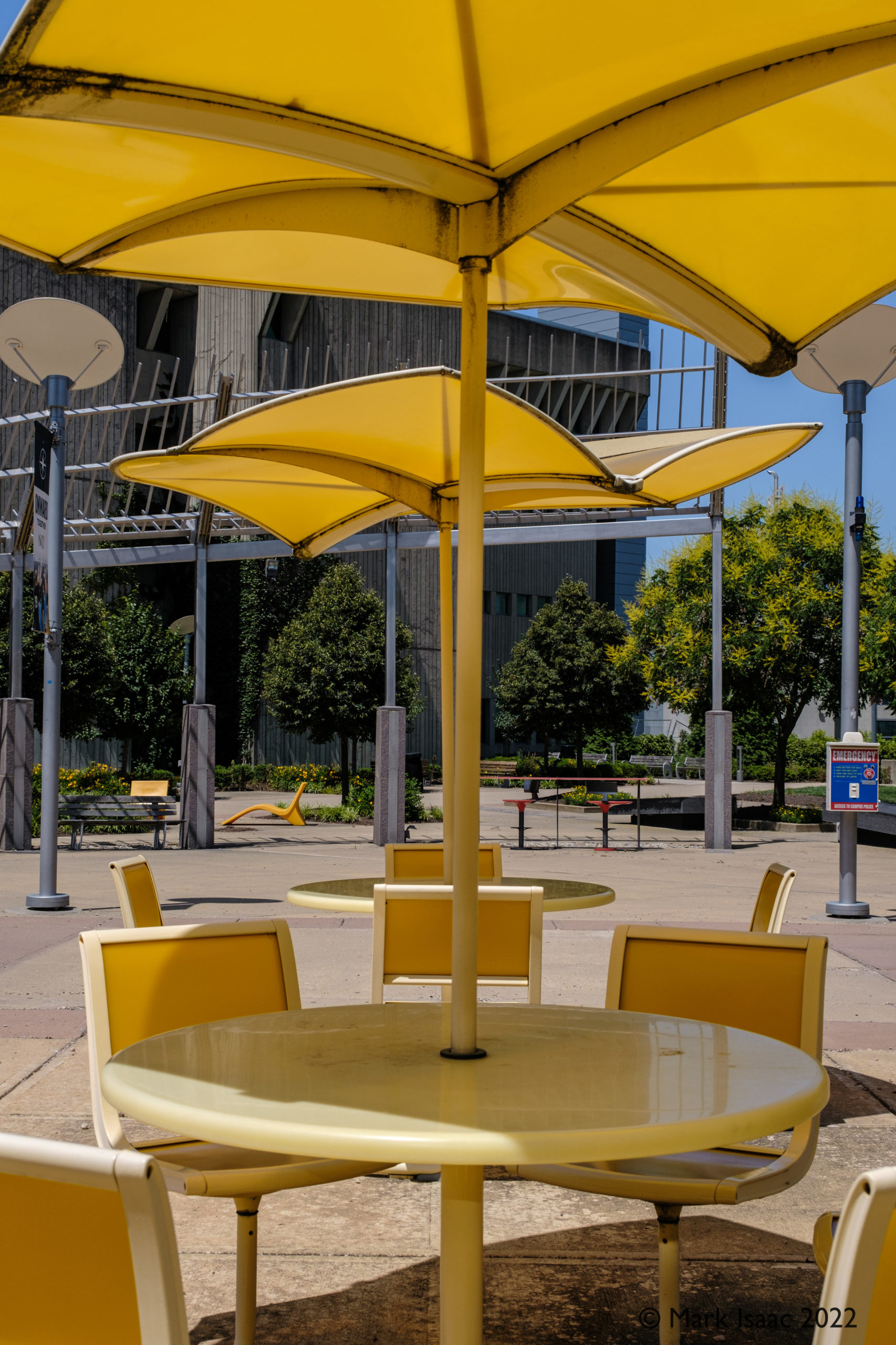
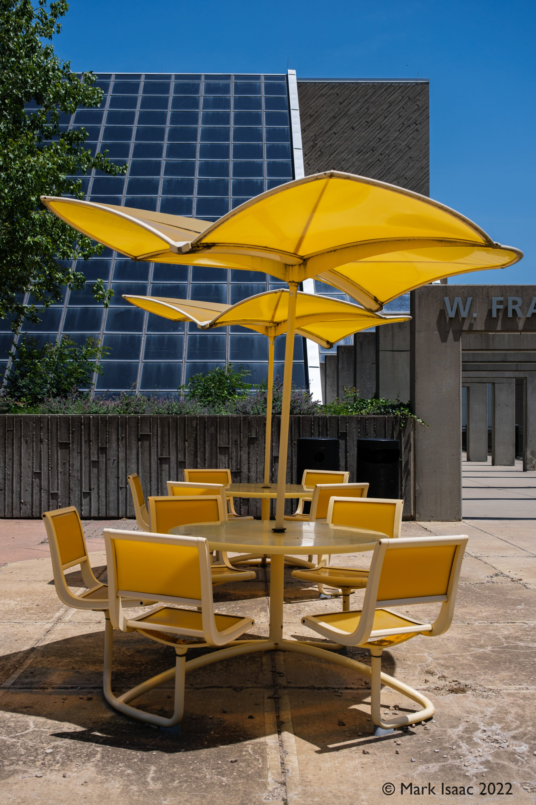
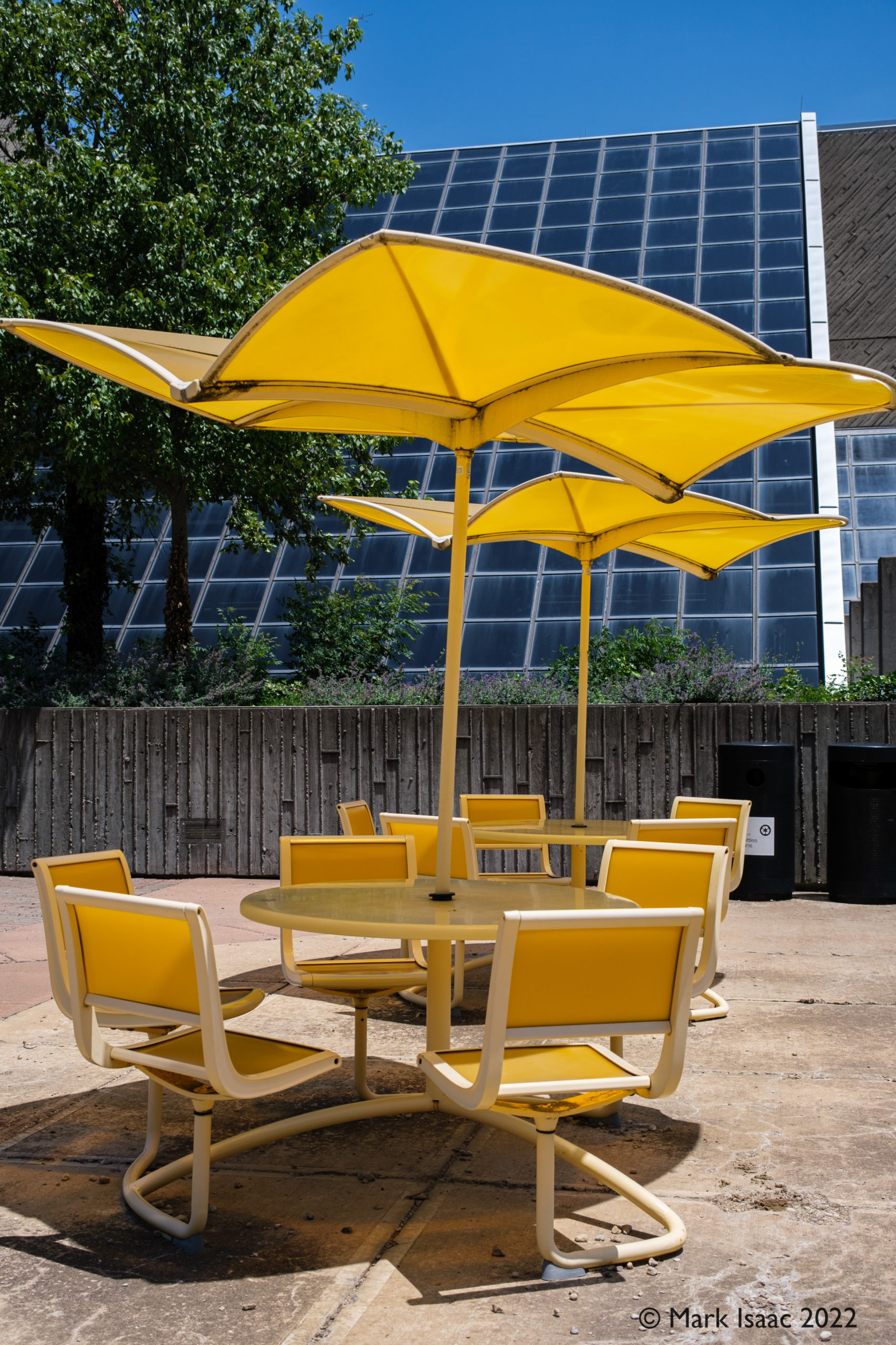
More effective at providing shade in this patio area outside the library are these tables, seats and Da Vinci style shades all in the same shade of bright yellow.
Shaded seating on the Library patio.
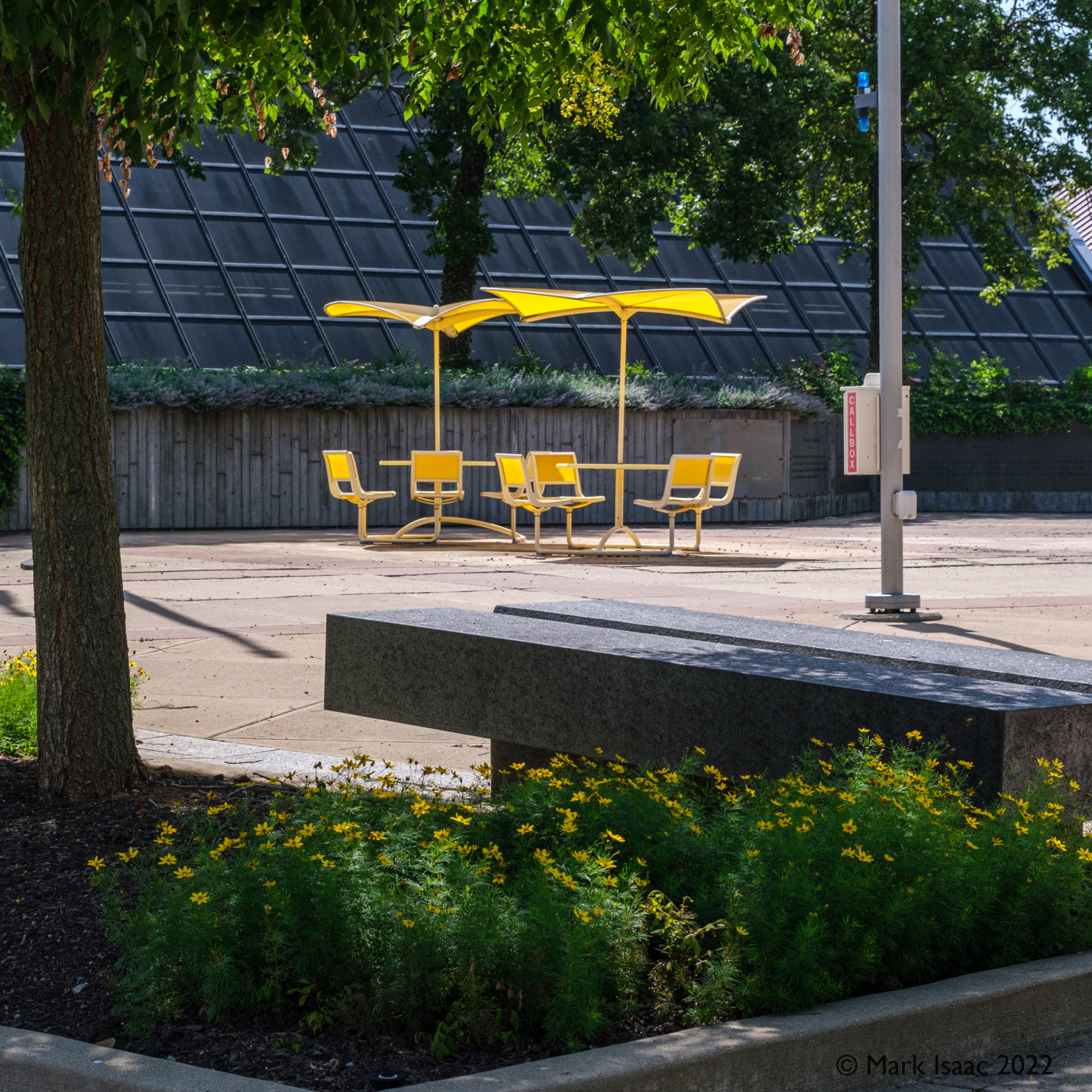
The building behind pictures 2, 3 & 4 is the Library with its huge picture window with built-in retractable shading. Picture #4 shows the measure of shade given to the yellow flower bed.
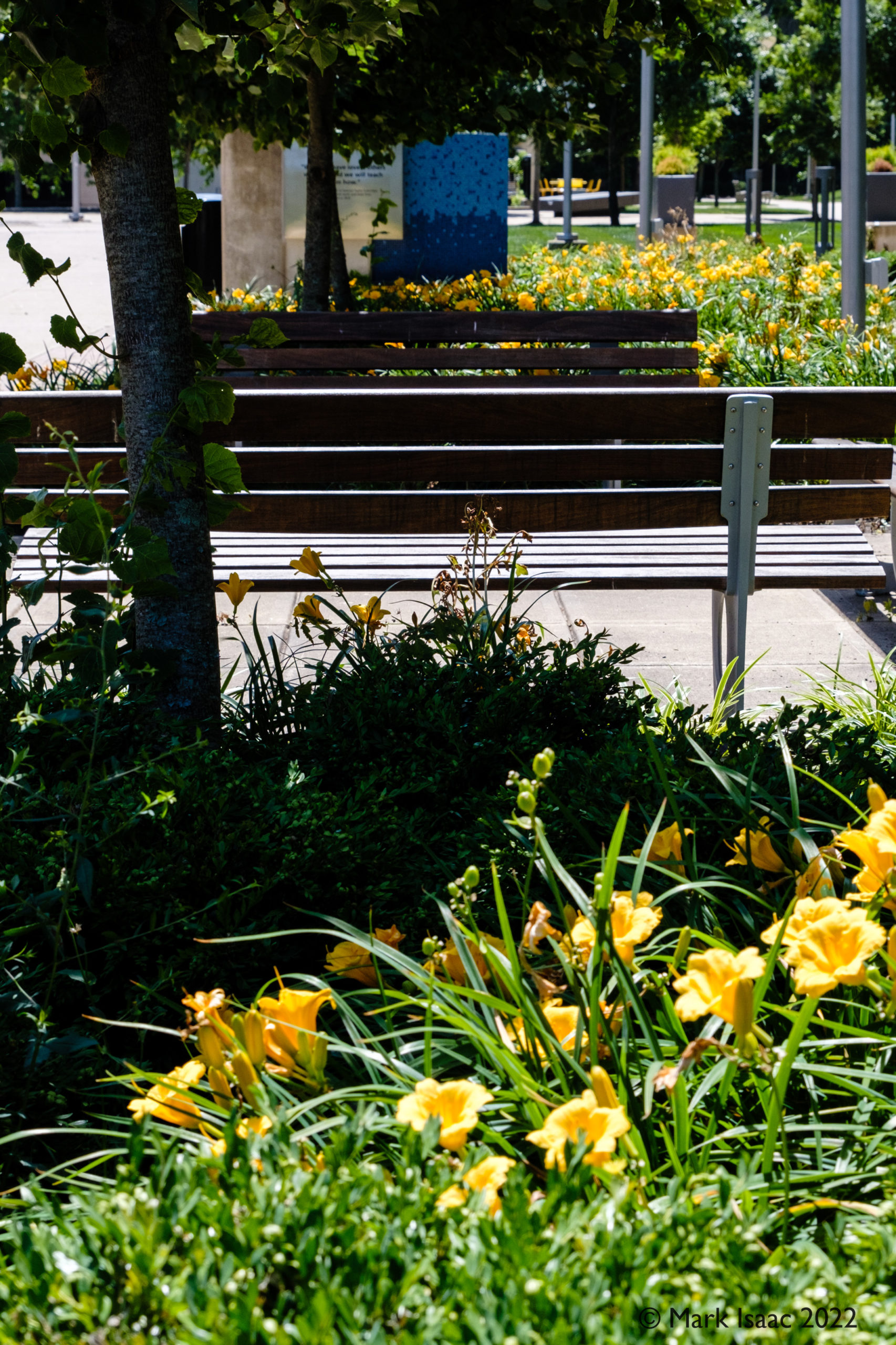
Man made and natural shading
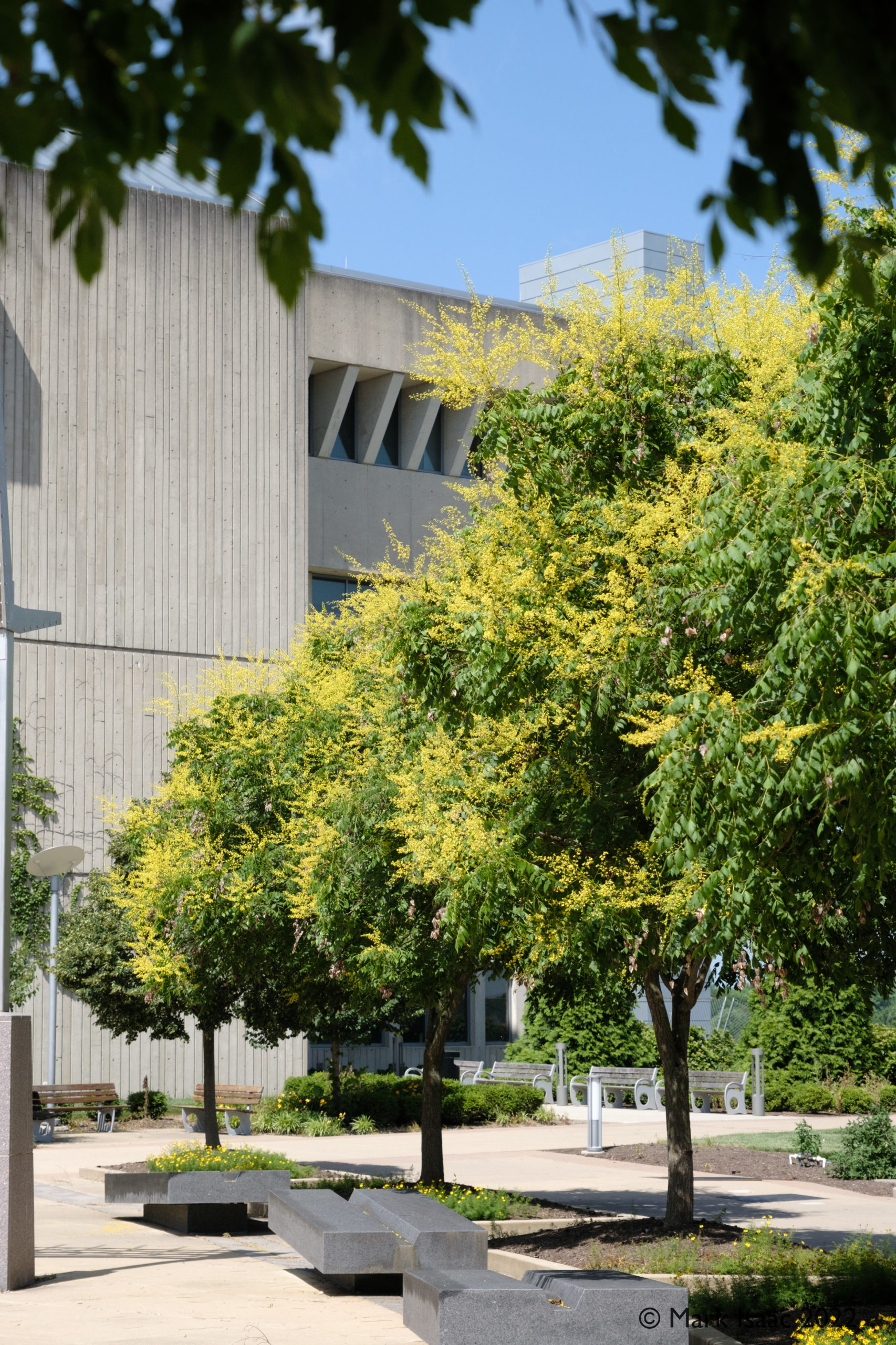
Different kinds of shade were provided by shade structures (#1), trees with yellow blossoms (#2), and benches under shady trees with yellow flower beds (#3) .
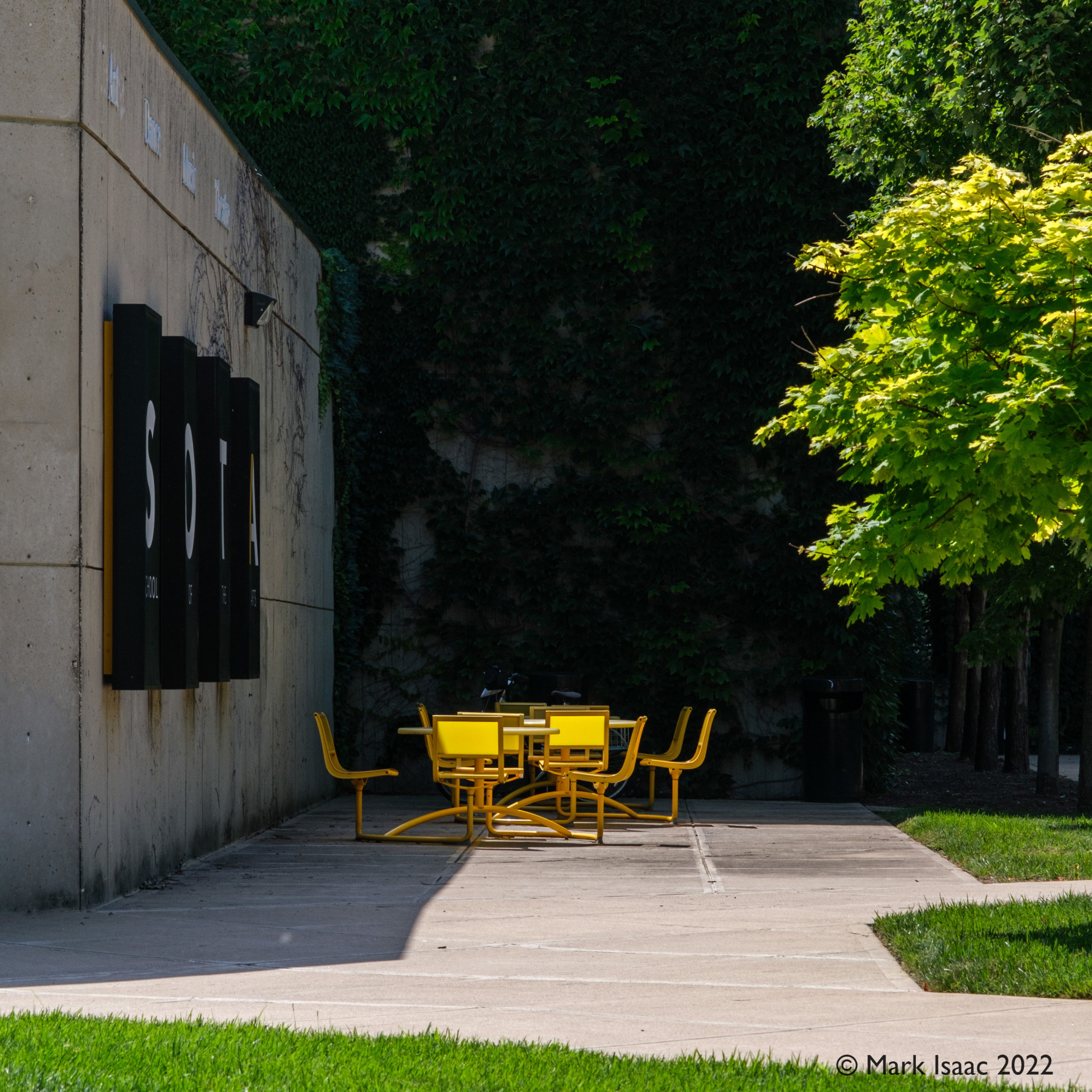
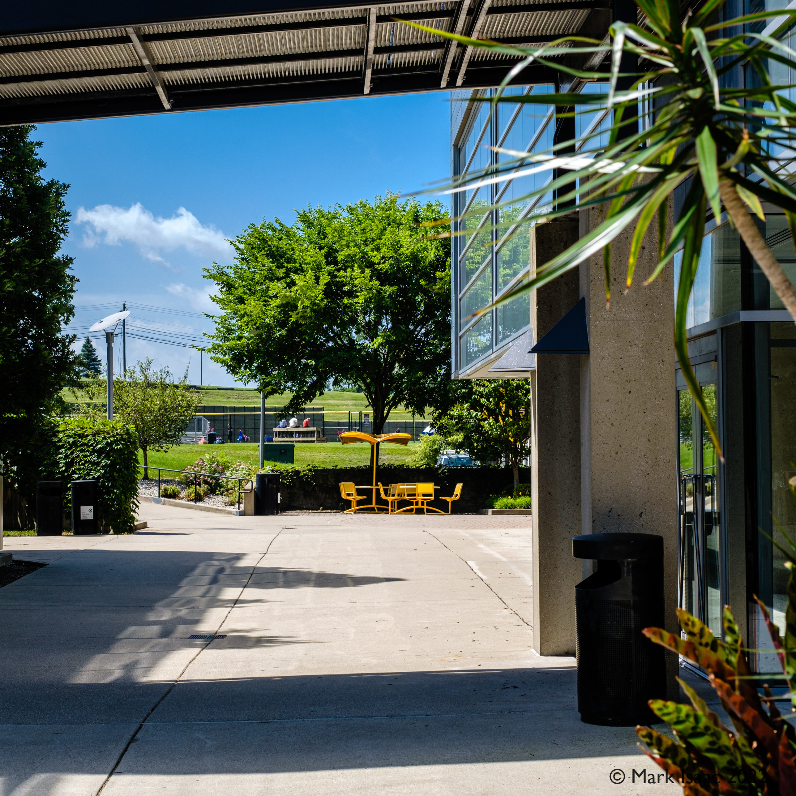
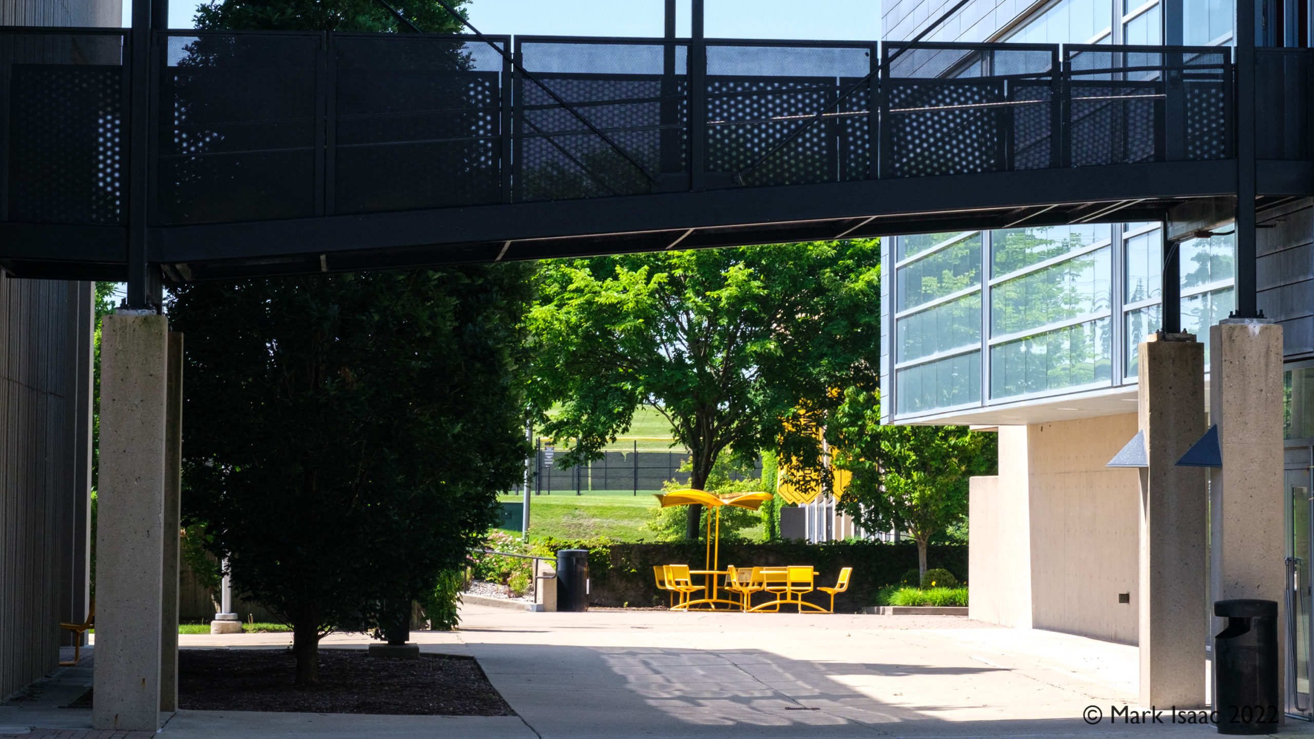
Campus wide shady table spots
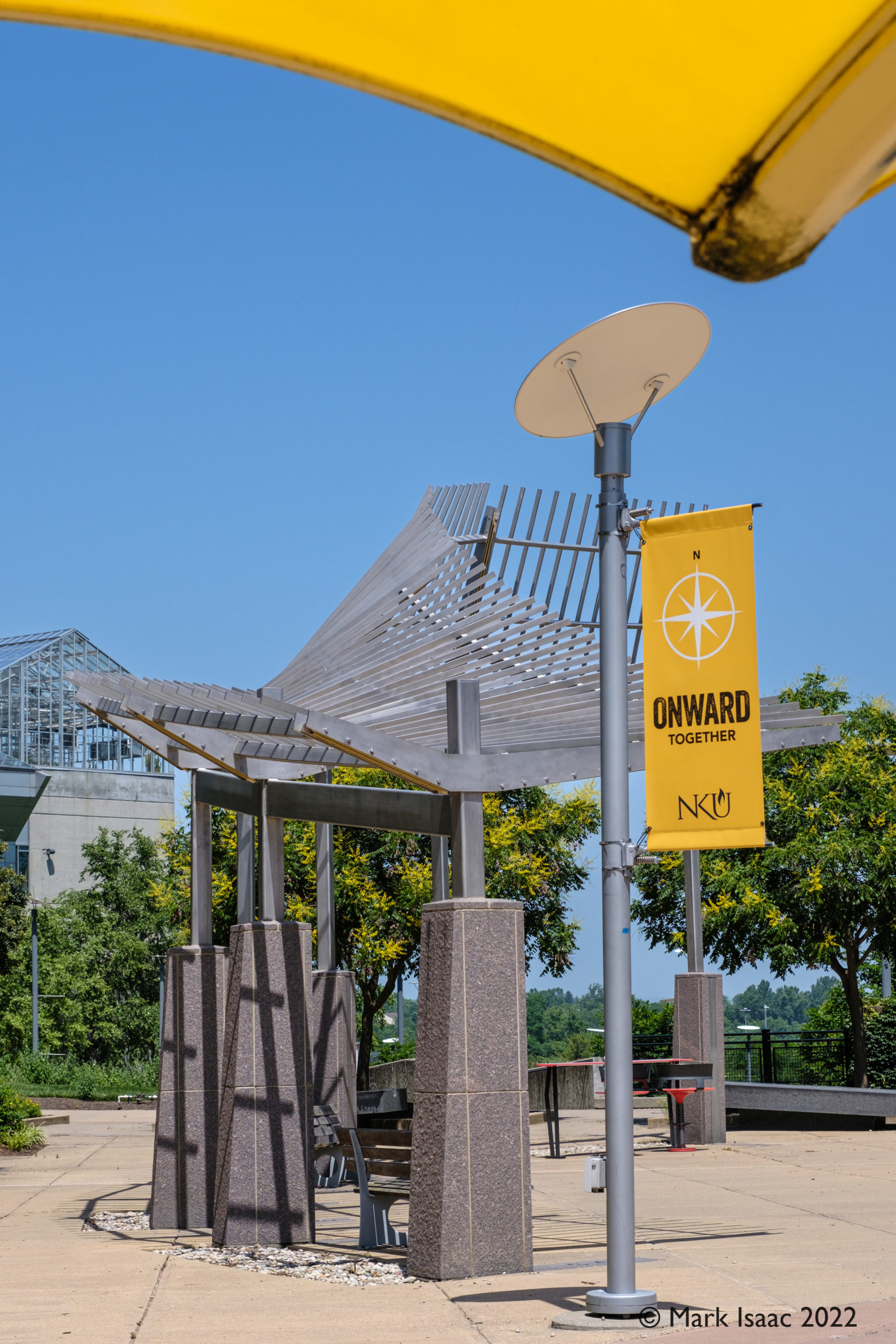
All over campus there were yellow tables & chairs in shady spots, next to buildings (eg Arts #1), or conveniently next to a hedge or tree (#2, #3).
Although there did not seem to be a central focal point for the campus the confluence of gigantic Science and Health Innovation buildings provided a circular forum with central plant bed and peripheral compass points which greatly helped navigating through this compact yet sprawling campus.
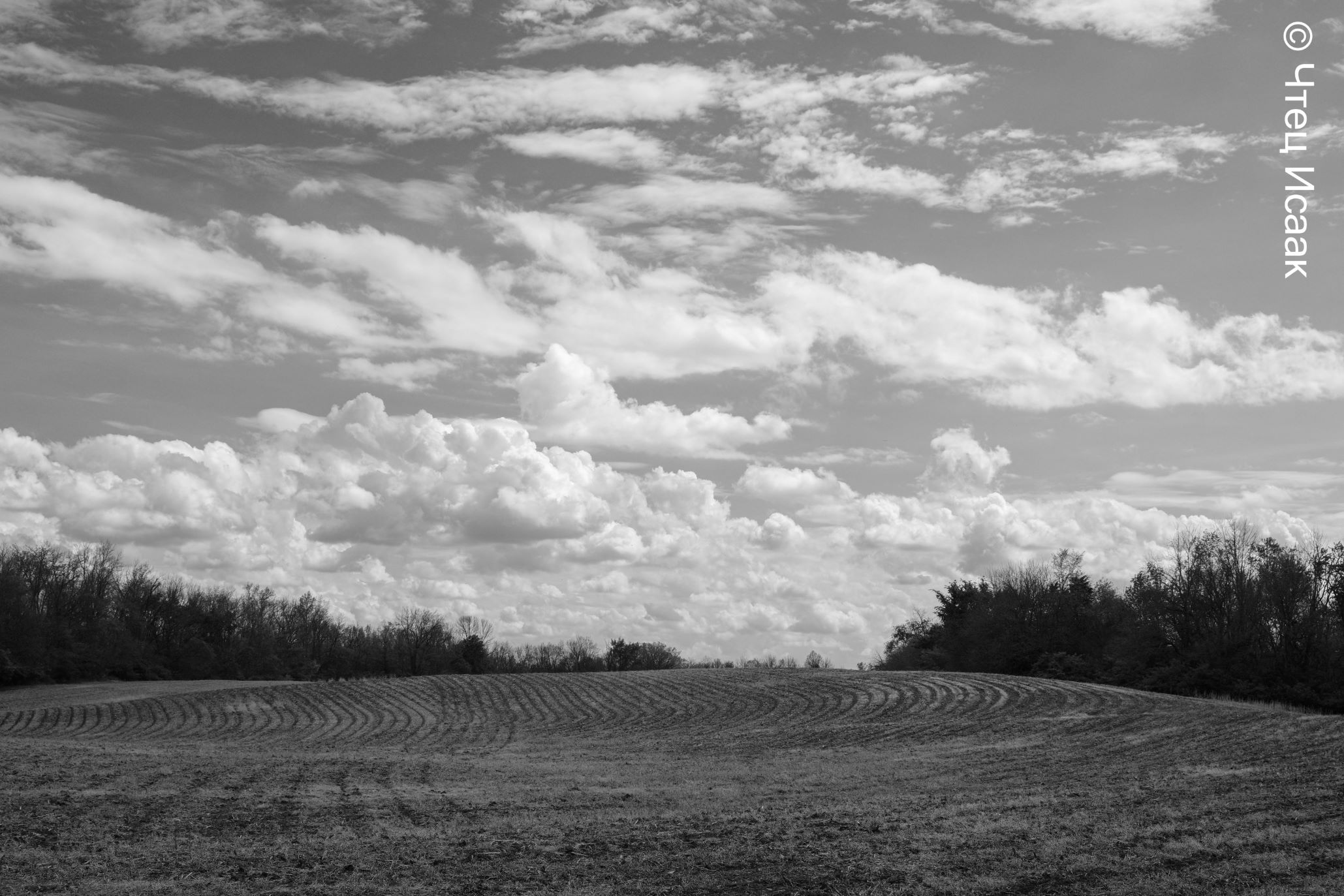
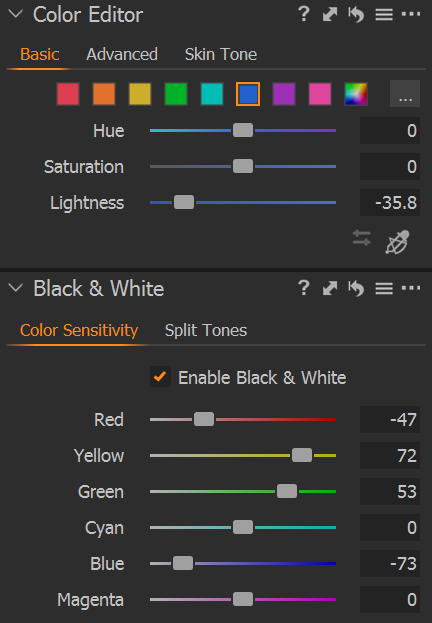
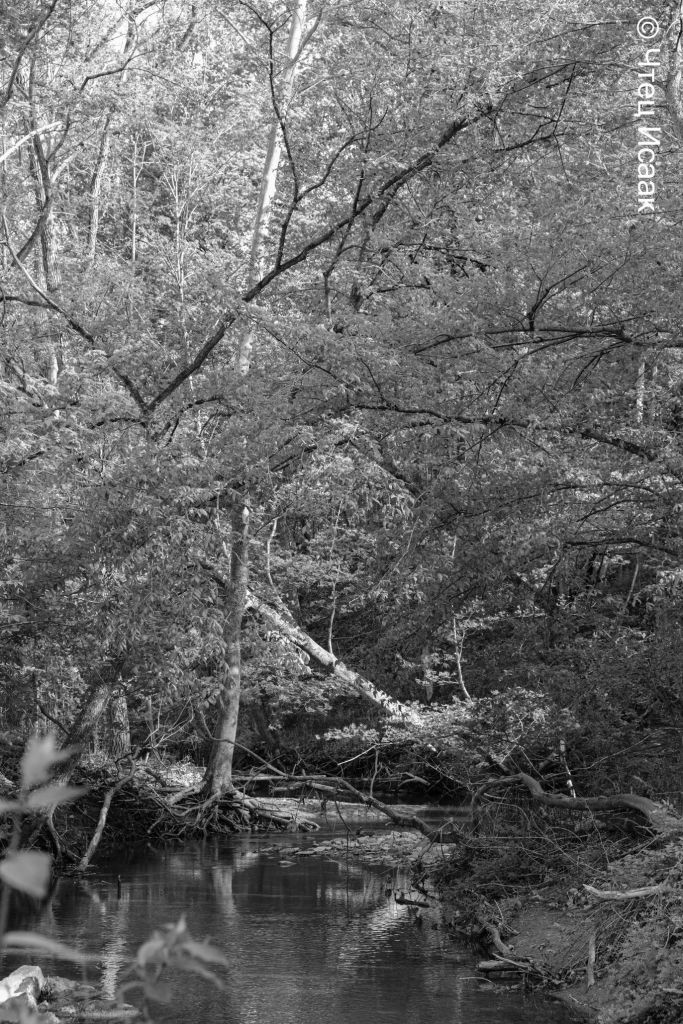
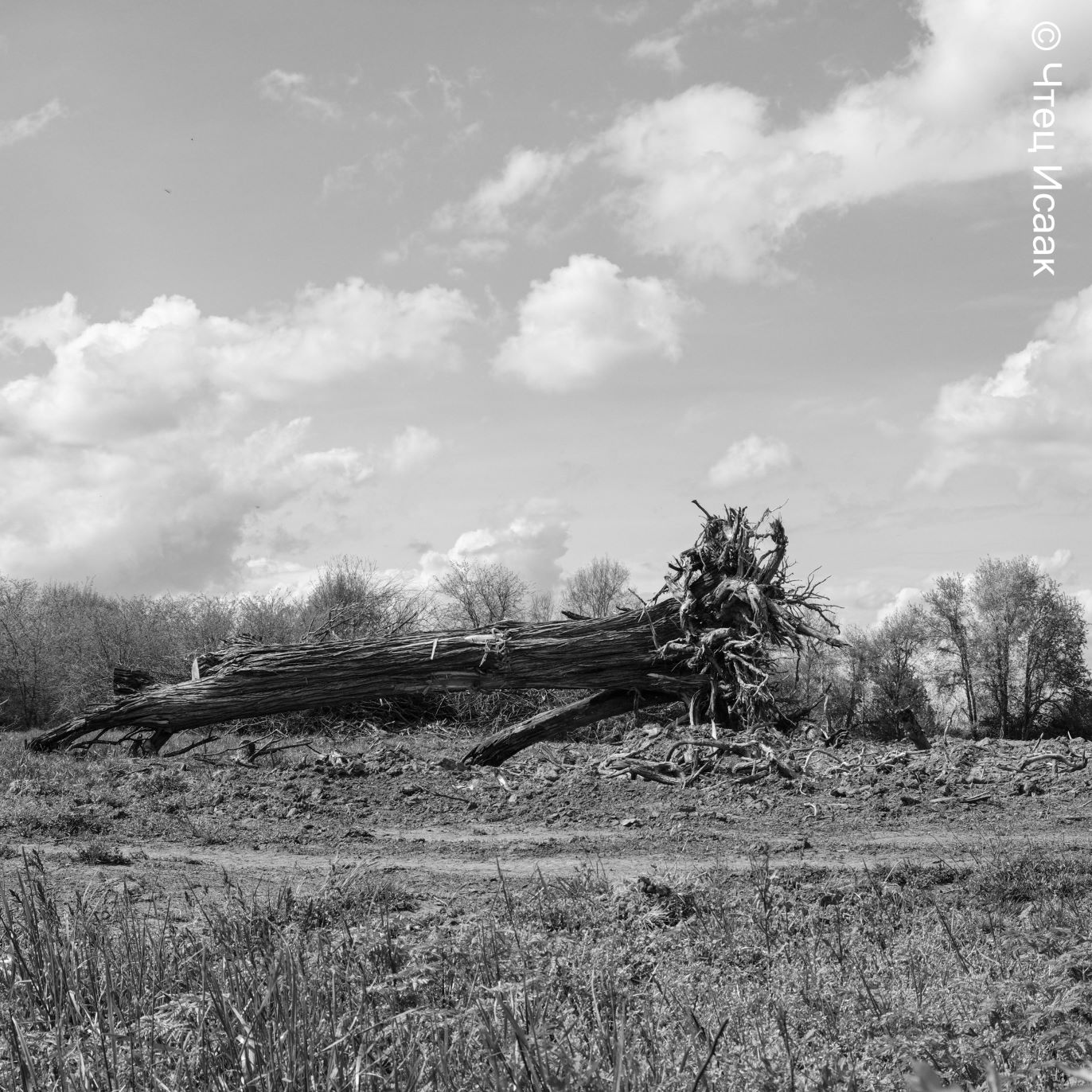
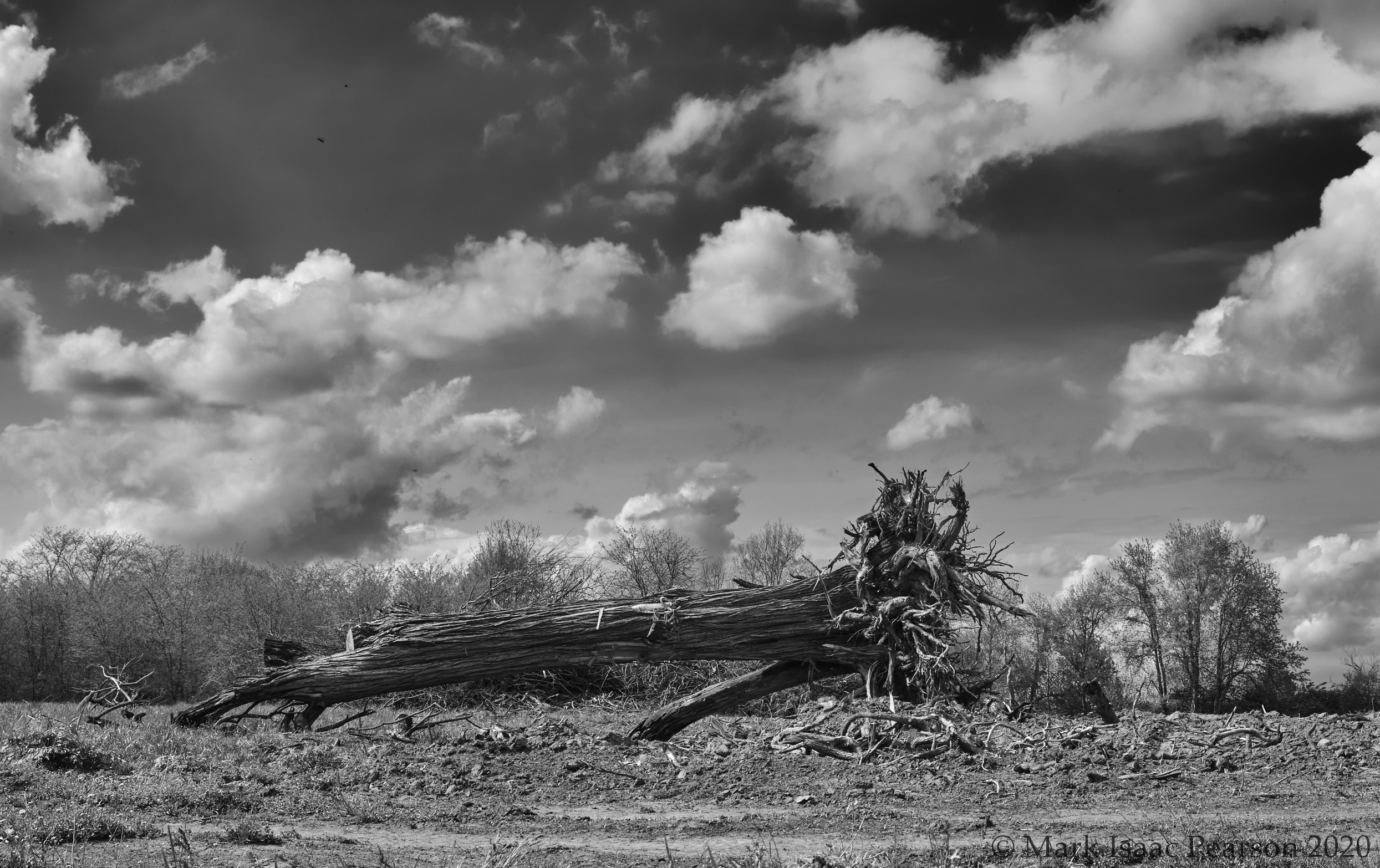
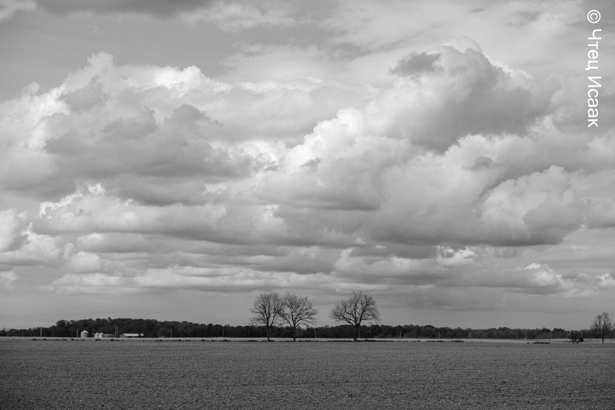
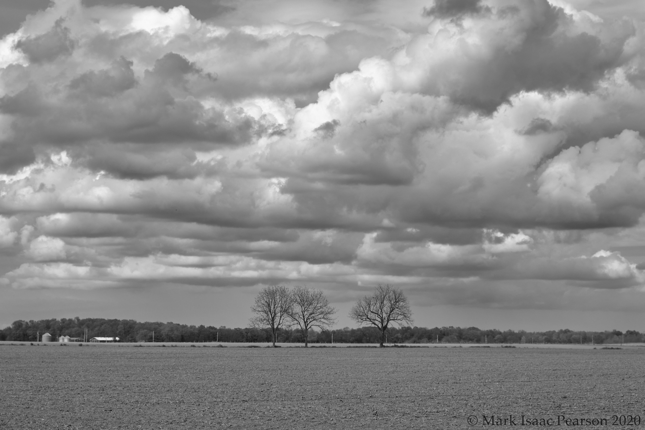
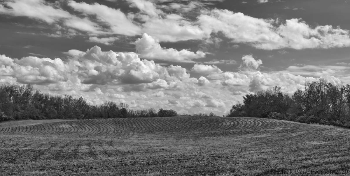
First of all I cropped so that the horizon was on a third horizontal. I pulled back the Highlight in HDR to accentuate the clouds. I added some clarity and structure to bring out the detail. In the Color Editor I darkened the Blue to accentuate the sky. Converting to Black & White I upped the Green and Yellow levels to lighten up the foliage in the middle. Then I pulled back the Blue & Red to darken the sky and earth tones respectively. You can see the difference between the jpg off camera & my efforts with the RAW file.
Example #2
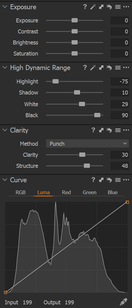
Settings used:
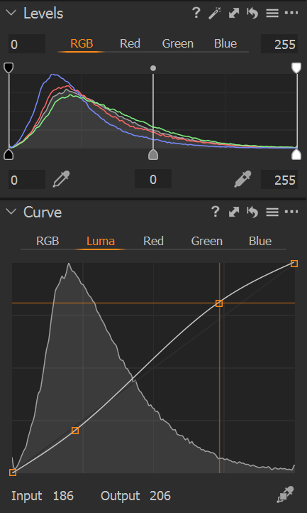
The major thing I did differently with this photo was to tweak the Curve : Luma. I took a point on the straight-line curve which corresponded to the peak of the curve in the shadows and then pulled it down a wee bit, and then at the equivalent end in the highlight end I pulled up by the same amount (see the Input/Output numbers on the graphic). This gives a slight S-shaped curve which is apparently characteristic of the luma response of black&white film emulsion. I think I will try the technique on more images to assess its usefulness.
Gallery
This gallery of pairs of photos shows the off-camera jpeg using the ACROS+Red Fuji film simulation immediately followed by the RAW edited in Capture One.
In the past four or five years I switched from Nikon (D600)+Panasonic (GX-7) to Fuji (XT-2, XT-30). There will be another posting about this switch. I have also used Adobe Lightroom for quite q while and became accustomed to its user interface and method of working. But on certain photo subjects I was getting what the experts called “wormage” — seriously. After a lot of research I discovered the reason — Adobe Lightroom does not handle demosaicing of x-trans RAF files very well; see Fuji cameras, x-trans sensors and RAW processing article for details. I still use Lightroom for the DAM (“Digital Asset Management” I think) but I have started to do most of my processing in Capture One and I have to say that it’s working out well.
So here’s what I found is a reasonable process to deal with monochrome shots (on shooting black & white, see here young man!). Comments abiout improving this would be well received!
Shooting tips
Configure your Fuji camera to shoot in RAW + JPG at the highest setting.
For film emulation choose ACROS + Red filter. This enhances skies.
On the XT-30 I configure the Q button to do focussing and the shutter release for exposure & taking photo. See another posting why I’ve had to do this (the location of the Q button is a royal pain).
in Light Room
1. Import from SD Card into Lightroom — configure the Preferences to make sure that no sharpening is applied to the RAW files (just to be on the safe side).
2. Select top shots (using * or ‘pick’) and ‘X’ out all shots to throw away — be bold! I find that I select no more than half a dozen ‘keepers’ from most shooting sessions, and usually a lot less. Group selected shots as separate JPG & RAW into a Collection.
3. Export the Collection into a named Catalog somewhere sensible. You will import this catalog into Capture One. Note that this will duplicate the files (can be a Good Thing). While still in LR delete all the rejects — be bold!
4. Quit LightRoom to free up Memory and screen space.
in Capture One
1. Use File > Import Catalog > LightRoom Catalog and select the appropriate .lrcat file in the well named and sensible location you used to store the LR Catalog (eg Pictures > LR to Capture 1)
Problem :
The RAW file is initially displayed by default in monochrome. But we need it in colour in order to manipulate the colours, exposure, levels, saturation etc. So :
2. Choose Color > Base characteristics > Curve was : Auto choose : Film standard / Provia or other color emulation
3. Fix Exposure > White Balance. Using the dropper on a greyish cloud will often give a good result. You don’t want the white balance to warm up too much. Try different areas of the image to get a better idea & press Ctrl-Z after each to return to default. If you fail to find a better setting than the out-of-camera setting one of the set levels , Daylight, Cloudy etc might work.
4. Cropping. This depends a lot upon the subject matter of the image and how it’s balanced. You can configure the Crop tool to have alignment gridlines in thirds. Rt-click on Crop tool and select ‘unconstrained’ to start with. Play around with some of the standard aspect ratios to get a sense of what looks best. Don’t forget that Square can be good too! I generally try to align a strong vertical or horizontal with a third and crop accordingly. Do this before applying image corrections because it will affect the Histogram.
My experience with the metering on Fujifilm cameras that I have used is that it tends to underexpose. So I often apply a + exposure compensation when shooting (up to +1 in third of a stop increments). But sometimes even this is not enough.
5. Adjust Exposure to take the white fluffy clouds to the far right of the Histogram just shy of clipping. Don’t worry — we’ll pull back most any over-exposure. Make sure the Exposure Warning is on — clipping will be indicated by red patches on the image.
Don’t touch Contrast, Brightness, or Saturation settings in the Exposure box. These are sledgehammers!
6. The clouds will now be much too bright probably. In High Dynamic Range box pull back the Highlight setting with ferocity. You can even go up to -100 ! Now you’ll observe the fluffy clouds have fabulous definition to them.
7. Now we’ll improve definition overall using the Clarity box. Choose Method : Punch and increase Clarity and Structure to taste, but not too much. I need to read up more on these tools. Note that the exposure also changes as a result & darkens up.
8. Now in the Exposure box adjust Shadows, & Blacks to recover some egregious clipped underexposure and increase White to brighten up the clouds (still leaving the great definition intact).
9. Now we’ll fix the sky colour to bring up the blues and deepen the contrast with the clouds. Choose Color box > Color Editor > Basic : Blue — slide Lightness into negative. Also try out Cyan. [I should also learn how to use the Color Balance Tool but right now it’s beyond me].
10. Now we should have an image with good colour contrast and saturation plus tons of detail and we’re ready to convert to Black & White. Note that all of these operations have been global — I have not done anything with Layers, local edits, Luma selection (ultra cool). If these were competition shots I would certainly look to employ one or more of these approaches.
Convert to Black & White
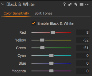
In Black & White box, check Enable Black & White.
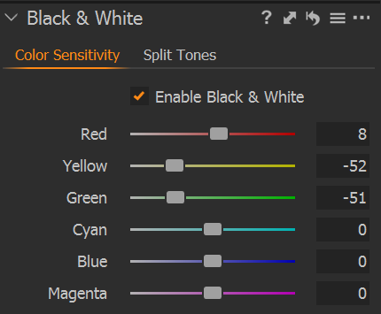
Now, here’s the cool thing. You can manipulate the grey sensitivity to each colour independently. You’re not restricted to a fixed mapping of colour to grey level. This can be incredibly useful as we’ll see in the next post. In the example above I have backed off the yellow & green levels to darken up the foliage. The great thing is that you see the tonal effect on the image as you move the sliders.
Here’s the image that these B&W settings are associated with :
Note that this is a totally different mechanism to the Color Filters of NIK Silver Fx which act more like a lens filter.
In the next post we’ll look at some photos and the settings I used to enhance them to produce B&W images.